Photo Corners headlinesarchivemikepasini.com
![]()
A S C R A P B O O K O F S O L U T I O N S F O R T H E P H O T O G R A P H E R
![]()
Reviews of photography products that enhance the enjoyment of taking pictures. Published frequently but irregularly.
Exposure 4 to the Rescue


27 December 2012
When her last surviving parent passed away, Auntie came into possession of the family photographs. But, as she had all her life, she thought of her little sister and asked us to make copies for her. Which meant photographing the prints and making new ones in our bathroom darkroom.
That's how you shared images 25 years ago.
We made our living with a process camera then, so it was easy enough to duplicate that setup on our drawing board at home.
We set up the lighting at 45 degree angles with a couple of special clamps fitted with poles and cold shoe mounts that we'd found at Photographer's Supply, where we bought all our darkroom chemicals. Two Vivitar 283s perched on the poles. Our 50mm Nikkor mounted to an FM2 on a Star-D tripod we'd picked up used in another photo store on Third St. completed the setup.
The prints took more than a few days to complete before we filed the negatives away in a binder. We still remember painstakingly spotting them of dust, a problem exacerbated by having to use glass to flatten the originals. Or maybe we painstakingly remember them.
What wonderful shots they were, though.
Auntie and her little sister grew up in the mid-West, living the kind of life Laura Ingalls Wilder so vividly described in her series of novels just reprinted by the Library of America. In fact, their mother wrote short stories on much the same themes, one of which was published by Good Housekeeping around Christmas in the 1980s.
So when little sister turned 80 and decided to throw herself a party, we thought we'd revisit the story about the two little girls at Christmas in the Depression and see if we didn't have a negative that might recall that story.
We did indeed. The two girls standing on the steps of a rough building during the Depression. We wondered if we couldn't transform that negative into something better than the print we'd worked up in our darkroom. A modern equivalent.
This time we could do everything from the comfort of our chair. We cleaned the negative with compressed air, mounted it in a film strip holder and dropped it into the CanoScan 9000F we rely on these days.
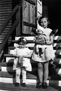
The Scan. A big (and immediate) improvement over the flat copy negative.
THE SCAN
Our last big scanning project was pretty extensive, going through several rolls of film to get everything. Mac OS X Lion had just come out and the two third-party scanning software solutions had just been updated. SilverFast crashed after just a few frames had been scanned (always on the same one) so we finished the job with VueScan.
But this time we just used Canon's ScanGear from Photoshop CS5. It does a pretty good job, letting us set the critical parameters in the Advanced tab. It doesn't do the multiexposure of either of the third-party solutions but this was a pretty flat negative as it was.
RETOUCHING
With a decent scan (no clipping in the shadows or highlights and enough resolution for the size of our print), we got busy retouching. There were defects on the original print we were able to fix with the Healing Brush, which we also used to spot smaller blemishes.
The Healing Brush is one of the greatest retouching tools ever invented. It's very easy to use (just set the brush size and swipe) and very sophisticated about what to mimic and how to do it (from texture to tone). You just can't tell with the naked eye that anything was done.
Then we had to worry about the more global corrections to tone. This is where it gets fun. Because no matter what it looks like on the monitor, you don't give your monitor to someone. You give them a print. And what it looks like when you print it is what matters.
FOCUS
That, it turns out, is always something like a dub job where you hope to match the new audio language to the old visual language, hitting the m's and b's and p's rather than pretending to dot your i's and cross your t's.
We were more than amused by Richard Benson's sacrilegious discussion of the uselessness of calibrating monitor display to printer output in his talks at the Modern Museum of Art (we've since chatted with him about that and will report shortly on our conversation).
And while there's no such thing as a match, nor any guarantee of one, between what you see on your monitor and what you see on your print, using the right ICC profile for the ink and paper you're using is a pretty good place to start.
We'd chosen a lovely Ilford Galerie Prestige Smooth Gloss sheet we'd been testing. And we had the profile for it. So we knew what our target was.
What we didn't know was how to turn that old photo, probably from a Kodak Brownie, into a modern print. So we experimented a bit, kicking up the contrast of the flat negative to something that just held detail in the shadows and trying out, in the process, various toning options. Selenium, Sepia, etc.
It was a little like trying to find the right tie.
EXPOSURE 4
Then it occurred to us to flip through some of the options various plug-ins provide. These weren't a lot different from what we had been doing the old fashioned way until we loaded Alien Skin's Exposure 4.
We're no expert with Exposure 4. And what follows can't be mistaken for a review. But it took us no time at all to try out a few of the numerous options, make whatever adjustments we wanted and apply them to the a layer of our Photoshop document.
The Interface. Exposure 4 tells you that you're leaving Photoshop and then takes you to a dialog box with four panes in. Three of them run across the bottom one, which is something of a tool bar. The middle one of the three on top is a preview. To the left of it is the list of filters (which is too extensive to even count). And to the right is a six panel pane of adjustments which include Color, Tone, Focus, Grain, IR and Age.
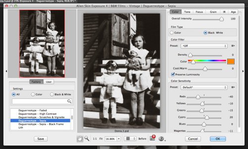
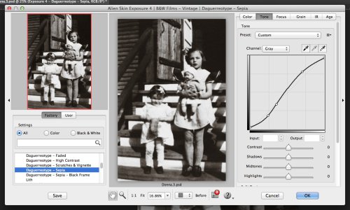
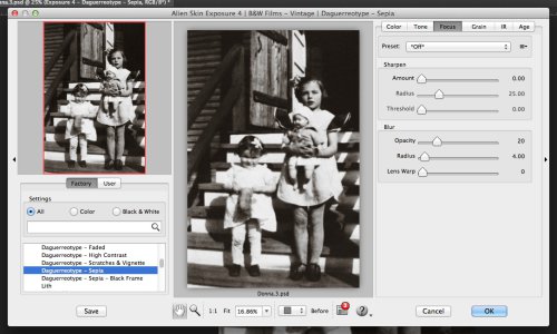

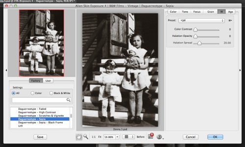

Exposure 4. The setting in the right-hand pane are: Color (top), Tone, Focus, Grain, IR and Age. Lots of options.
You could spend a lot of time in there.
Options. Alien Skin loves to talk about its stuff and one of the tool bar options takes you right to its blog. We dropped into see what it has to say about portraits.
In Exposure 3 or 4, try the presets for Kodak Portra 160NC in both the Color Films | Print and Color Films | Print | Low Contrast folders. The low contrast version is especially good for a calm feeling and healthy skin. It has low grain, but you may want to completely turn grain off. Also try other films in that Low Contrast folder.
Look in the Color Focus folder for the Glamour Shot presets. Don't be turned off by the silly name. Yes, some of them are over the top, like mall portraits, but the low intensity versions are useful. These presets use a semi-transparent blur, like putting a silk stocking over the lens. The presets with Halation in the name use a blur found on the IR tab that only affects bright areas. The other presets use a blur on the Focus tab. In Exposure 4, try Glamour Shot | Halation (| Contrast) and Glamour Shot | Low. You can easily tone them down with the Overall Intensity slider found at the top of the Color tab.
Look at Ektachrome EES | Subdued in the Color Films | Slide folder. EES is a little darker and more grainy, which some people like because it is "moody."
Now I'm straying pretty far from the original question, but it's worth mentioning Black and White films. Many of those are great for portraits. Try ones in the B&W Films' Low Contrast folder, especially Agfa Scala 200 and Kodak Technical Pan. Also try the Glamour Shots in the B&W Focus folder.
Split toning is more artsy, but sometimes I love it for portraits. Look in the folder B&W Split Toning for Gold Split. Even better, look in the B&W Misc Effects folder for the High Key and Toning presets.
Well, we were dealing with a black and white image, so we started with the Glamour Shot | Low filter. That softened the contrast a bit, which was particularly helpful on the faces, which were in direct sun.
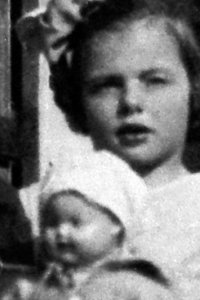
Then to add a little color, we added another layer with the Daguerrotype | Sepia. That warms the faces up a bit and adds back a little depth.
One side effect of these Exposure 4 filters was to minimize the grain of the original scan without losing sharpness.
THE PRINT
The proof is in the print, though. So we fired up the Epson R3000 and evaluated our 5x7 print.
We made a slight adjustment toward a lighter print for the final but we were much happier with our digital print than we ever were with our traditional darkroom print.
CONCLUSION
The advantages of the digital print were extensive.
First, we were able to rescue a thin negative with a good scan, redistributing the tones over the whole scale. Second, we were able to erase the imperfections of both the original print and the copy negative (dust, mainly) with ease. And without any special skill either, we should add.
Then we were able to polish the image with Exposure 4's extensive filter set. We minimized grain and fine-tuned contrast with the Glamour Shot filter and added a warm tone to the print with the sepia Daguerrotype filter.
And finally, we were able to print on a luxurious paper from the comfort of our chair. No chemicals to mix, no light to mask out, no wet paper to dry.
We were, in short, able to focus on the reproduction rather than the process. And the result brought to life a fond memory for Auntie and her little sister on a special day.