Photo Corners headlinesarchivemikepasini.com
![]()
A S C R A P B O O K O F S O L U T I O N S F O R T H E P H O T O G R A P H E R
![]()
Reviews of photography products that enhance the enjoyment of taking pictures. Published frequently but irregularly.
Madbits Momentsia Makes Real-Time iOS Collages


21 December 2012
With the release this week of Momentsia by Madbits, the camera in your iOS device learned a new trick. And, even better, it's so simple to use you don't have to learn it. So even old dogs can do it.
We downloaded a copy of the 99 cent app. It's available in the Apple App Store and via iTunes.
COMPATIBILITY
Optimized for the iPhone 5, Momentsia is compatible with the iPhone 3GS/4/4S/5, iPod touch (forth and fifth generation) and iPad 2/3/4/mini. It requires iOS 6.0 or later.
We ran it on an iPad 2 running iOS 6.0.1. With no trouble at all.
HOW IT WORKS
There's no documentation but we did say you wouldn't have to learn it, didn't we?

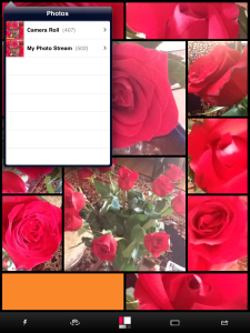
The Interface. The orange tile hasn't been filed yet. Overlay shows Camera Roll.
Tap the icon to launch Momentsia and your screen turns into a set of colored rectangles with five icons at the bottom of the screen. The rectangles are color coordinated, so you might just enjoy looking at them for a second but they're really active photo areas. Just tap one to turn on the camera.
Makes sure, though, that you haven't flipped your iPad cover over the camera lens. Yes, we did that, turning the tile black. But we figured it out.
When you've lined up the image you want in the active tile, guess what? You tap the tile again and the camera captures the image. So it's tap to select, tap to capture and, well, just move on to the next tile.
Or, you know, retap it to activate it again to replace the shot.
That's real-time collaging, to coin a new word.
OPTIONS
You do have some options, as the menu bar along the bottom of the screen suggest.

The Menu. Flash, Camera, Tile, Border, Share.
The one you'll use most is the Tile button in the middle, which looks like the Momentsia screen. Tap it to see a different layout with different colors.
Madbits created color sets for each group of colors. There are, we were told, 59 colors sets made of four colors. So for any four-image layout, there are 59 color schemes available, although the color assigned to each tile is random.

A Dozen Roses
We certainly didn't get bored by the patterns. Or notice any repetition.
The first button on the menu bar, a lightning bolt, is apparently to control the flash (if your device has one). There's no flash on the iPad 2, so it didn't do anything but wink at us.
The second button toggles between the forward- and rear-facing cameras. So you can get yourself in the composition, too.
The third button is the Tile button, which displays the layout, as discussed above.
The fourth button toggles between the border options. Considering all the possible color combinations and number of tiles, border options are limited to a safe two: black or white.
The fifth icon is the Share button. It displays four buttons along the right edge of the screen (which are obscured by any active tile on that side, so finish your composition before you share). The four options are: Twitter, Facebook, Instagram, Email and Camera Roll.

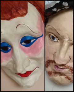
Masks
SHARING
Once you've finished a composition, what do you do? Well, you save it to your Camera Roll, for one thing. Just tap the Share button and then the Camera Roll button to save the image.
But you can also speed your image off to your favorite sharing service if it's Twitter, Facebook or Instagram. And you can email it, too.
You can tweet and instagram your collages with the #madbitsmoments hashtag, too.
TIPS
You're under no obligation to fill every tile. You can leave a few colored tiles untouched if you like. You might want to add some type, say, in another app and make a card of the thing.
You're also under no obligation to use multiple tile layouts. Hold the Tile icon down a second to get a one-image, single-shot layout. The tile is colored anyway and you still have to tap it to activate the camera but it works.
The border options, just black or white, are active even in single-shot mode.
We'd have liked a particular layout once in a while (an evenly split screen for The Masks above, for example. But you can't drag the borders around, so don't obsess. Go with it.
Madbits claims Momentsia is "the first camera app that works at your brain's speed, never slower." And it can keep up with the party, too. It's really a fun alternative to sequential snapshots, building one image from several moments.
CONCLUSION
It's funny. It's been a watershed year for high end digital cameras and we've even seen a few fancy compositing features (a frame overlay, say) show up in modest digicams.
But all the fun seems to be with smartphones and tablet cameras. Momentsia is just one more example but it's a very good one.
We can think of several enhancements we'd like to see. But this is Madbits' first app and we'd rather stand up and applaud the simplicity of the interface. It doesn't get in the way of the fun but enhances it.
One guarantee. Nobody will flip through your snapshots when you capture a moment with Momentsia. They'll linger on the image a while, pointing to this tile or that one.
Snapshots never had it so good.