Photo Corners headlinesarchivemikepasini.com
![]()
A S C R A P B O O K O F S O L U T I O N S F O R T H E P H O T O G R A P H E R
![]()
Reviews of photography products that enhance the enjoyment of taking pictures. Published frequently but irregularly.
Painting A Photo


29 April 2013
As artists, photographers suffer an uncommon indignity. We're often just stuck with the composition we find. Even a golfer gets to move the ball sitting in an unplayable lie. But not a photographer. We have to shoot what we come across the way we found it.
Painters have it sweet, in comparison. They start with a blank sheet. An empty canvas. They draw some composition they've assembled in the studio or conjured out of thin air. Unplayable lie? No such bird in their aviary.
That's why we've taken to watching three PBS (who else?) painting shows on Saturday morning to get the old motor running. It isn't the brush technique or the color mixing that sticks with us. It's the image composition.
But this week things took a dramatic turn.
Gary Jenkins on "The Beauty of Oil Painting" introduced a technique that combines photography and painting. He didn't take credit for it, acknowledging a landscape painter at a show who had introduced him to the idea. But he demonstrated it.
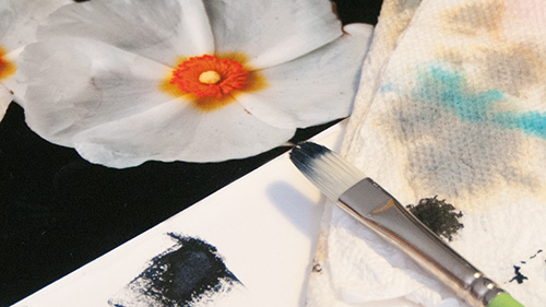
Color Test. We try to match the background color of our flower image before painting over the photo and onto the illustration board.
The dramatic turn isn't the technique but the crazy idea that as a photographer, we might invest in some illustration board and acrylics to take a page from our painter friends. "You can do this," as Jenkins says.
In a nutshell, here's the technique.
Find a photo you like and crop it tightly. Say it's a flower with long flowing petals. Crop the images so the ends off the petals are no longer in it (yep, truncate them) and print the image on a thin photo paper (heavy sheets don't work well for this technique).
And as far as that goes, we're guessing a pigment ink printer with a porous, instant-dry paper would be best for this project.
Take a spray adhesive and give the back of the print a coat of glue. Then mount the print on the oversized illustration board. Jenkins was using something like a 6x6 photo on a 15x20 board. You'll want to measure out the position on the board before you spray the adhesive on the photo, of course, so you know exactly where to put it.
Smooth out the photo with a roller (or the back of your hand over a protective sheet of paper).
Then the fun starts.
Jenkins took a paper towel dipped in linseed oil (because he's using oil paints) and rubbed the exposed illustration board so his paints would flow easily. You can do the same with an acrylic medium if you prefer to use acrylics.
With the surface prepared, he started by mixing a dark color found in the image and painting into that dark where it crossed the edge of the image, extending the dark onto the illustration board.
Once he had his darks extended, he mixed some of the light colors in the image and overlaid them on the darks, moving into the picture and back out onto the board so the transition was seamless.
The success of that seamlessness depends on being able to mix the colors accurately, but the general idea is to pull the darks out of the photo window onto the board and then make them real with highlight detail.
It's a very quick technique and lends itself to Impressionist-like dabs and dribbles that nicely complement the realism of the photo. So you don't have to know how to draw to do this. And as a photographer, you might prefer more rough and unbelievable painting to highlight that photo anyway.
Jenkins did this with a flower but he got the idea from a landscape painter and it works just as well with the old family portrait too.
So the next time you're frustrated with your lack of control over the scene you're shooting, keep this trick in mind -- and give it a shot.