Photo Corners headlinesarchivemikepasini.com
![]()
A S C R A P B O O K O F S O L U T I O N S F O R T H E P H O T O G R A P H E R
![]()
Reviews of photography products that enhance the enjoyment of taking pictures. Published frequently but irregularly.
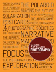
Book Bag: '100 Ideas That Changed Photography'


17 July 2013
This is the big orange book in the '100 Ideas' series from Laurence King Publishing, which covers Art, Graphic Design, Film and Architecture in addition to Photography.
We like the concept. Curate some ideas that have shaped a field and give each of them a few words and a few images.
In fact, it might work very well as a Web site. Post one new entry each week. A person might learn something. With no need to stop at 100.
As a book, the concept seems -- despite the author's disclaimer that it's only a sampler of the 10,000 ideas that became photography, itself an idea -- a little too final. Even as a sampler.
If it isn't encyclopedic, it surely packs a lot into each "vignette," as Mary Warner Marien, Professor Emerita in the Department of Fine Arts at Syracuse University, calls her short essays on each idea.
And the ideas she illustrates are far ranging. They include Cropping, the Darkroom, Kodachrome, Photo Booths, the Photogram, Photojournalism, the Halftone, Photo-Sharing, Fashion, the Shutter. To name a few. The cover of the book (above) has a few more.
We find them worth a meditation or two. And it doesn't hurt that the ideas are lavishly illustrated as well. In fact, that's the main reason to indulge in this title. The images. They come from far and wide, and include both the ancient and the modern. And they get full play, often the whole (large, 8.25 x 10.5-inch) page. They're the stars of this show.
In fact, we've nearly given up trying to read the text. We just look at the pictures.
Because we can't see the text, frankly. Captions are set in a 6 pt. italic type. And the more normally-sized body text eschews hyphenation on a newspaper-like line length of 12 picas (well, that's measly even for a newspaper) so the word spacing is disturbing. Too disturbing to actually read comfortably.
We have, unfortunately, 100 ideas for the typographer responsible. If there actually was one. We suspect the butler did it.
In fact, we'll bet the farm that the most egregious error in the book is the result of that poor typography for the captions. Idea No. 62 is the SLR. There are two illustrations. A publicity still from Michelangelo Antonioni's Blow Up (in portrait orientation of all things) and a Leica rangefinder, an odd choice itself.
The caption under the Leica reads, "The Leica A camera, the first commercially successful SLR, made from 1925 to 1936." Um, no. It was the first commercially successful 35mm camera. But it's not an SLR. It's a (somewhat primitive) rangefinder.
We don't think this is the author's mistake, though. We think it was a simple transposition by the person setting type who confused 'SLR' for '35mm.' It wasn't caught in proofreading because nobody could see it.
The author herself is quite clear in the accompanying text that the Leica's innovation was to free the photographer from a tripod but that, as a rangefinder, it didn't permit the photographer to see through the taking lens. A problem the SLR solved, she points out.
The text is solid. The caption is wrong. By a word you can barely see.
There's a lot in this book. The photos are worth the price of admission. But the essays are full of history that promises an education. And you can never have too much education.
100 Ideas That Changed Photography by Mary Warner Marien, published by Laurence King Publishing, 216 pages, $29.95 (or $21.15 at amazon.com).
