Photo Corners headlinesarchivemikepasini.com
![]()
A S C R A P B O O K O F S O L U T I O N S F O R T H E P H O T O G R A P H E R
![]()
Enhancing the enjoyment of taking pictures with news that matters, features that entertain and images that delight. Published frequently.
Friday Slide Show: Bouquets To Art


21 March 2014
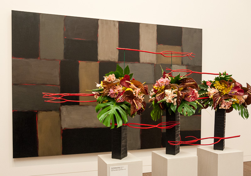
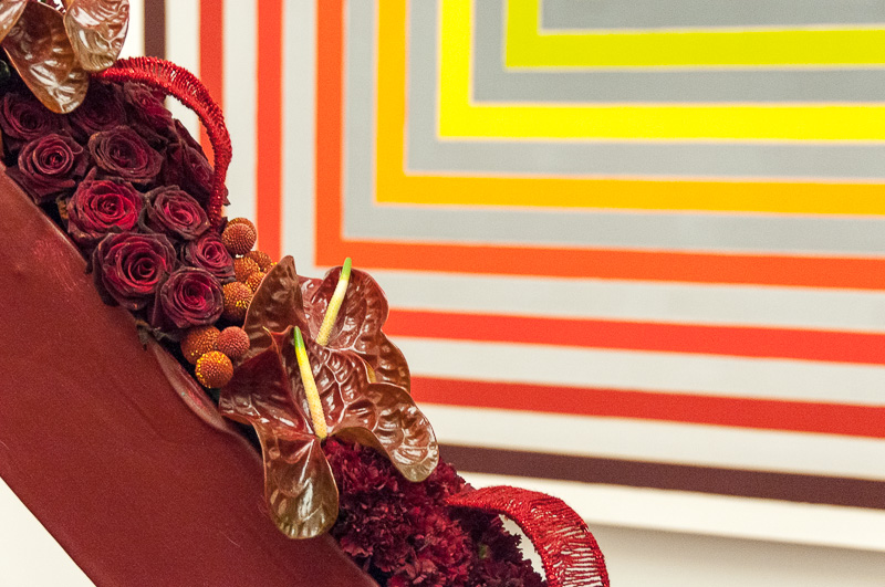
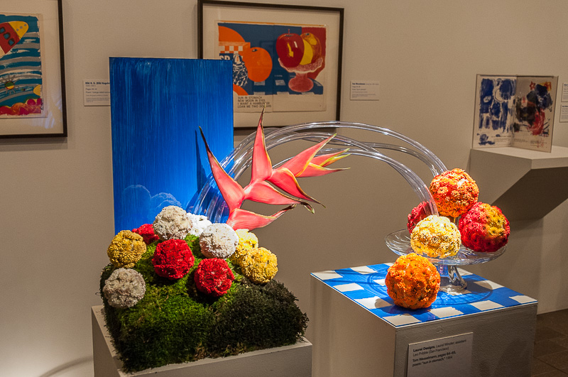
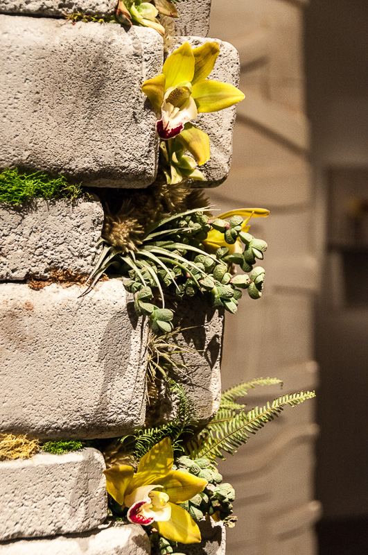
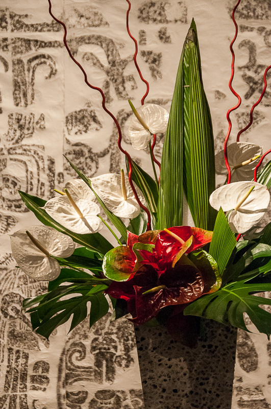
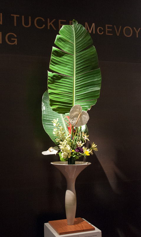
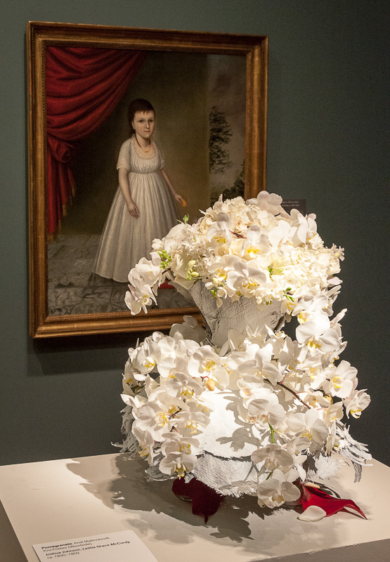
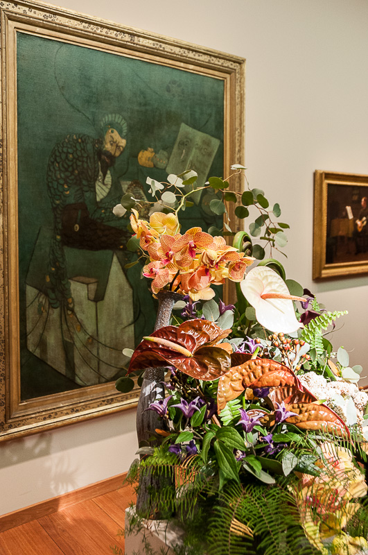
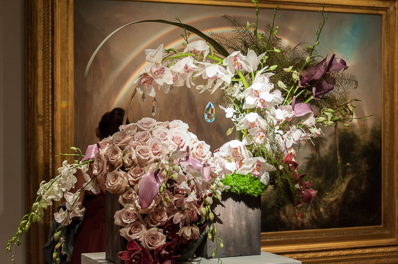
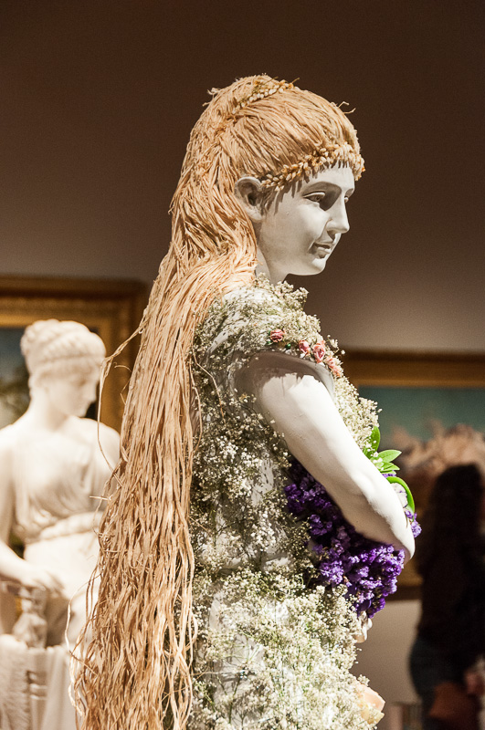
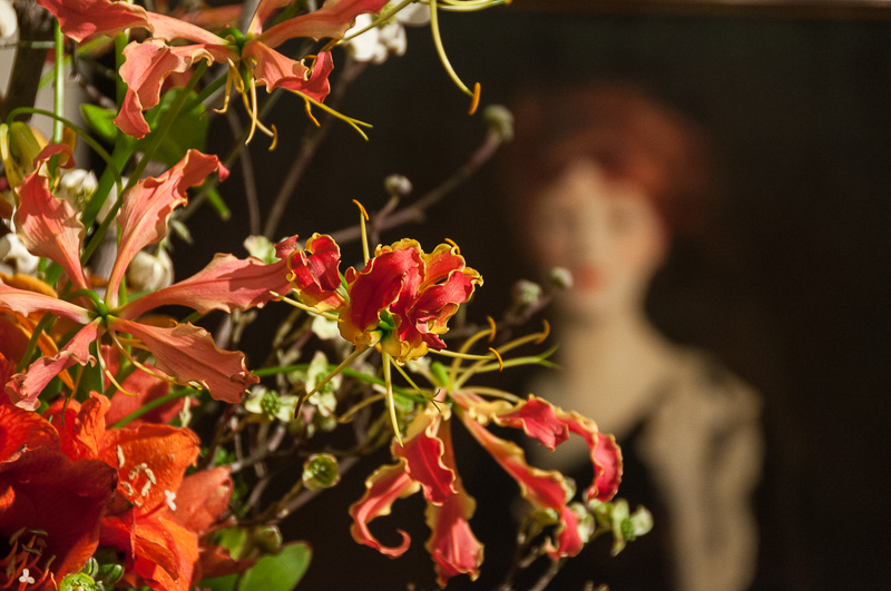
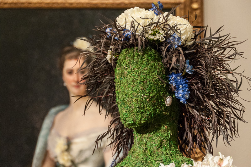
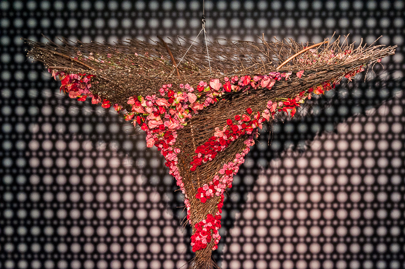
Every spring for thirty years now, the de Young Museum has put on its Bouquets to Art exhibition. Various local florists, designers and garden clubs assemble a bouquet to one or another of the museum's paintings and sculptures in the permanent collection. Photographers are welcome, so off we went Wednesday evening during extended viewing hours to see the show.
Before we went, though, we did a little research.
RESEARCH
Our last visit with a camera was in 2011 when we were reviewing the Olympus XZ-1, a compact digicam we found very handy. We took 88 shots that time and they were all safely tucked in our archive and tracked in Lightroom. So we set a filter for them in Lightroom to see what our exposure settings had been.
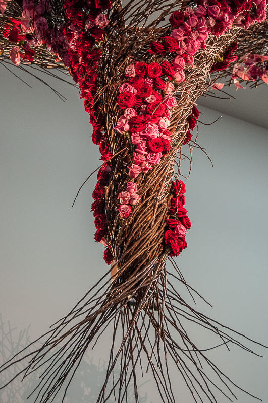
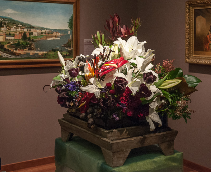
Centerpiece. A spiral of roses.
There were four things we wanted to know:
- What was the predominant ISO setting?
- What focal lengths were most prevalent?
- What shutter speeds did we use?
- What apertures did we use?
The answers would determine which lens we'd bring and how we'd preset the camera, a Nikon D300.
ISO. Of the 88 shots, 85 were taken at ISO 800. Not to leave you hanging, two were taken at ISO 200 and just one at ISO 100. The paintings are always displayed in a somewhat subdued light but the bouquets are lit with spots (and not evenly at that). So ISO 800 makes sense for ambient light but we'd have to be careful about the highlights. And being careful means shooting Raw, something we hadn't been able to do with the XZ-1.
Focal Lengths. Our focal lengths had been all over the place as we tried to compose each shot in the viewfinder but we shot 16 at the widest angle and another 14 not far from it. So we knew we'd want a wider angle than our primes and some variation. Considering the subdued lighting, we opted for an 18-200mm zoom with image stabilization. We would be able to shoot throughout the range at shutter speeds as low as 1/30 second.
Shutter Speeds. Most of the shots were taken under 1/60 of a second, about evenly split among 1/25, 1/30, 1/40, 1/50, 1/60, 1/80 and 1/100 before thinning out. Again that suggests how important image stabilization would be, particularly since our zoom would not provide as large an aperture as the XZ-1.
Streaming Crowds. No break in the action.
Apertures. Everything we captured with the XZ-1 was at an aperture wider than the 18-200mm zoom provides. Most as f1.8. That was dramatic enough that we decided to bring along a 35mm f2.8 prime just in case.
One thing we added to our kit this time was a lens filter. We were expecting a crowd (and museum crowds are notorious for their blatant disregard for human life). It's always better to lose a filter than a lens. So we protected the 18-200mm lens with a Hoya UV(0) filter.
A word about ISO 800. We knew we wouldn't have any visible noise in our Web-sized images but we also knew modern noise reduction software is perfectly capable of cleaning up anything that bothered us, too.
GETTING TO WORK
We arrived just after the doors opened at 6 p.m. and experienced such a crush of visitors at the door we nearly gave up on the idea of shooting the show.
Usually a little patience goes a long way. The initial wave passes and you can get a clear shot before another wave passes through.
But not that night. It was a steady stream of people for the two hours the museum was open. And if you think we were wilting in that trapped heat, you should have seen some of the more delicate flowers.
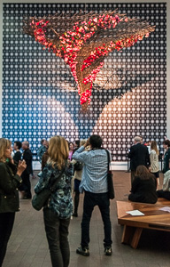
Crowds have their own dynamics, as Elias Canetti once explained at length. And crowds with smartphones have a suffocating dynamic. The wide angle lens of a smartphone obliges the photographer to get in close, blocking the view for everyone else. And as soon as one smartphone moved along, another slipped right in, no matter who had patiently waited their turn alongside them.
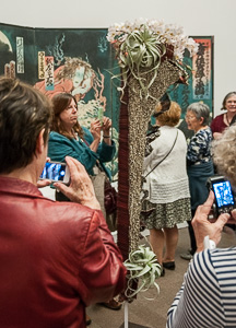
Surrounded by Smartphones. The noose tightens.
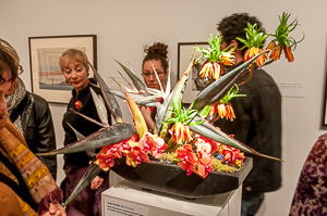
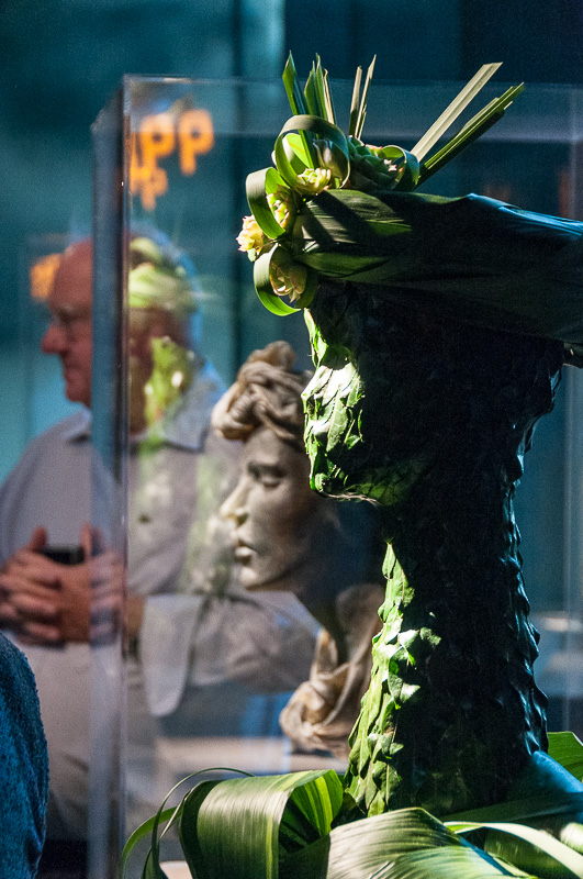
This problem was exacerbated by the pairing of the floral displays with their artworks. In many cases, only one angle showed both the bouquet and the art so there would always be a huddle of people with their smartphones firing from that spot.
While that sometimes left a clear shot to the odd side of the display, it associated the bouquet with the wrong painting. You get a shot of the floral display but not the art it celebrates. That defeats the purpose of the arrangement and ruins the shot.
But the crowd dynamic can't explain the gent who, having survived his wife's comments about one arrangement in front of them, paused in front of it to check his email as we stood patiently waiting for him to move on. We did tapped him on the shoulder (we were that close) to remind him he was not alone.
Strange evening.
COMPOSITION
Under the circumstances, we decided very early on to concentrate on composition. We gave up on the 35mm prime, which would have required more physical navigation to deploy than was possible in that crowd.
We also gave up on any sort of automatic exposure, relying entirely on Manual mode. We set ISO to 800, opened the aperture up to f4.5 and, with optical stabilization active, set the shutter speed to 1/30 second.
We did leave one setting up to the camera, though. White balance. Between normal museum lighting at night and the spotlights, balanced differently at each installation, we would have had to take a test shot with a WhiBal before each photo. Instead, we hoped to be forgiven for assuming conditions inside a museum wouldn't stray too far from daylight, which the camera could figure out all by itself.
Of course, we weren't shooting blind. We could evaluate our approach immediately. And we did. The LCD thumbnail looked representative of the scene and our histogram was well distributed if primarily low-key, as you would expect.
By a Nose. Not posed.
And, actually, our manual settings worked out better than the XZ-1. Crisp, well-lit shots in focus, generally.
We broke one rule we rarely even bend. We deleted images during the shoot. We'd compose our shot, set focus and then wait for someone in the way to move on. But just as we fired the shutter someone would enter the frame. Delete, reset, fire again.
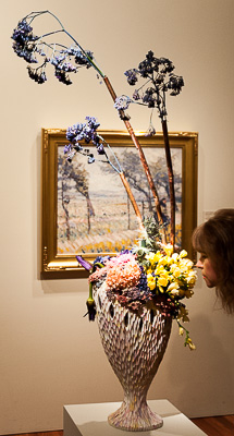
One shot survived this purging. A woman managed to lean in to smell the flowers of one bouquet just as we fired the shutter. We thought we'd keep that one.
Somehow it summed up the night.
POST
We were relieved to step back out into the cool night air but for a photographer there's more to it than the shoot. We call it post production.
We managed to snap 94 images, which we converted from Nikon's native NEF format to Adobe's DNG before backing them up to three devices and importing them all into Lightroom for review.
Lightroom does a better job than most browsers in interpreting the Raw image and creating an optimized preview, which can't be said for simply displaying the built-in JPEG preview. So we had an idea of where things stood and how far we could push them.
Would we, for example, have to change our plans and return to the museum to reshoot?
Well, no. Exposures were in the ballpark, highlights pretty well contained and recoverable, shadow detail salvageable too. Only a few where out of focus, a problem we had in Live View mode once as we hoisted the camera overhead (you really need a tiltable LCD for that to work).
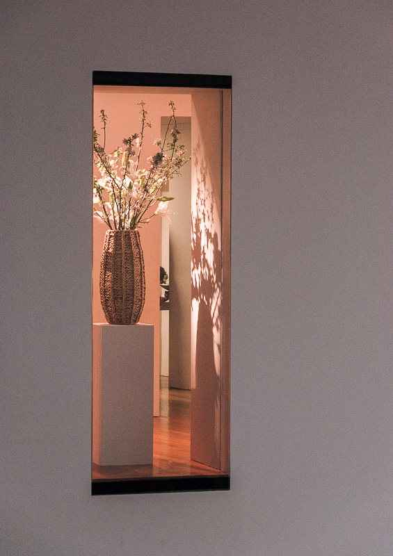
And those crowds? Did we manage to avoid blurs rushing past us? Yes, but we had to do a little cropping to isolate the art. Looking at today's slide show, there's so little evidence of the crowd, we thought we'd pepper the story will illustrations of the problem. Otherwise you wouldn't believe us.
That's the magic of post production.
BASICS
We didn't do any corrections in the Library module, going directly to the Develop module.
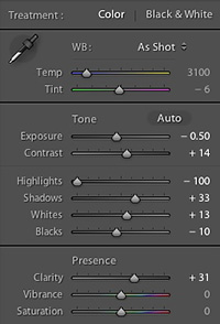
Lightroom Sliders. Typical adjustments.
The first thing we did was in Lens Corrections, enabling profile corrections and removing chromatic aberration. Because so many of these images have rectangular references in them, we also relied on Auto upright correction on quite a few images. Once in a while, we turned it off, but it was almost always useful.
Then we cropped the image, getting rid of empty wall space, body parts and other infelicitous appendages.
With the composition set, we were ready to work on the color and tone.
We preferred to drop exposure a bit from the Auto correction (which tended to over-brighten the scene) and recapture highlight detail where the spots had burned it white while fiddling with the Shadow slider until we had a nice tonal balance. We adjusted the Whites and Blacks much less than those controls but did need them now and then.
In almost every case, we bumped Clarity up. It's a weakness, we know, but we can't help it.
Once in a while a pinch of Saturation helped the image, but these captures were pretty vibrant to start with.
And very, very rarely (two images, if we remember) did we fudge white balance, primarily the Tint.
PUBLISHING
Of the 94 images we shot, we selected 76 to publish as an Adobe Revel album. That collection is more of an event overview than a refined selection of images, though.
We installed the Adobe Revel plug-in for Lightroom 5, selected the images we wanted (by simply filtering out the unrated ones) and created a publish collection (as Lightroom calls it) with the selection. Then we simply published the collection to Revel.
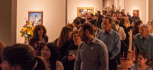
The Crowd. You really couldn't appreciate the displays.
Sounds confusing but the step-by-step instructions are clear. For your amusement, we've left the album online.
We found the images a bit brighter on Revel than they were in Lightroom (and are in our slide show). They actually look overexposed. Our export settings for Revel are the same as they are for plain exports. So we uploaded a set of 45 images, a bit larger, as a Behance portfolio for comparison. They don't look bad there.
Those 45 stand on their own (although we actually only really liked 24 of them), which is a pretty good percentage, but for our slide show here, we usually don't want to exceed about a dozen images. We just couldn't help ourselves.
Enjoy!