Photo Corners headlinesarchivemikepasini.com
![]()
A S C R A P B O O K O F S O L U T I O N S F O R T H E P H O T O G R A P H E R
![]()
Enhancing the enjoyment of taking pictures with news that matters, features that entertain and images that delight. Published frequently.
Of Forests And Trees, Bushes and Leaves


7 October 2014
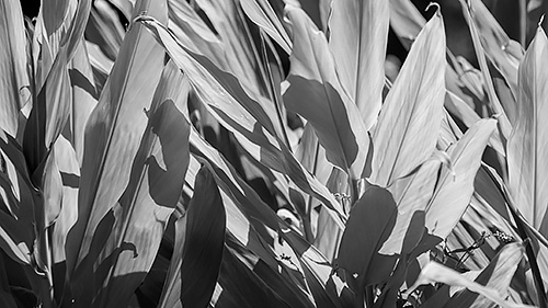
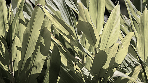
When we walked by this plant shooting out from the banks of a little lake, the the plant's leaves were filtering the afternoon sun and casting shadows on themselves just for fun.

We captured the image at f5.3, 1/500 second and ISO 400 with a circular polarizer on the lens as a Raw file, getting lost in the leaves.
We thought that might make an interesting image to play with but we weren't sure if it would be more interesting in color or monochrome. In color it was already pretty much a monochrome image, but we wondered if the yellow light might make it glow a bit too much.
These are questions you can answer in post processing.
We converted the NEF Raw file to a DNG on import, as we usually do for both the integrated edits (no sidecar file) and integrity checking (a built-in checksum). Then we opened it in Photoshop CC 2014.2.
Color First. Adobe Camera Raw tackled the color image first. We applied a Daylight white balance to the image for starters but it really looked too yellow, so we cooled it down a little, moving the slider slightly toward the blue end and away from the yellow.
Well, we should say that the slider ended up just slightly more toward the blue end than Daylight had it. We actually moved it all over the place just to see what the options were.
We cropped the image to a 16:9 aspect ratio for the site, too. And we added a little clarity.
What we did not do was convert to Grayscale in Camera Raw. At this point we just wanted that color image to make its case.
Monochrome. Once we opened the image in Photoshop, though, we added an Adjustment Layer to convert to Black and White. Proving it was nearly a monochrome image to begin with, the only sliders that made much difference were Yellow (which we brightened) and Green (which we darkened). This gave the black and white image not only more contrast but more texture (which is the practical effect of more contrast).
Muted. Torn between the two images, we faded the opacity of the black and white back about 25 percent (it was on a layer of its own, after all) to reveal a bit of the underlying color.
That only made the decision worse. We liked all three.
It's not a monumental work, of course, but as a decorative piece being able to manipulate it three ways in a few minutes is a real blessing. One you only get with post processing.