Photo Corners headlinesarchivemikepasini.com
![]()
A S C R A P B O O K O F S O L U T I O N S F O R T H E P H O T O G R A P H E R
![]()
Enhancing the enjoyment of taking pictures with news that matters, features that entertain and images that delight. Published frequently.
Friday Slide Show: The Gray City


27 March 2015
We've been playing with the images we captured on our little escape all week. We really didn't know what to make of them.
They weren't a set of images covering some event. They weren't isolated frames (even if we isolated our Cityscape) either.
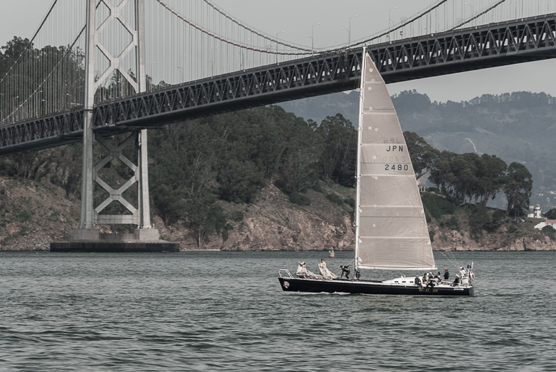
We thought we could enforce some theme on them, selecting just the shots of the Bay Bridge, for example. But that struck a false note.
A SELECTION
As the week went on, we'd try one or two or three things to see if we couldn't get to what it was about some of these images that we really liked.
Usually we work in silence. Once in a while, we put on some music, but it's rare. This occasion seemed to call for Bach.
He just turned 330 as we learned from the last image in this series.
We just happened to have his Sonatas BWV 525-530 transcribed for flute and harpsicord with Paula Robison on the flute and John Gibbons on the keyboard.
We put that on as the fog pressed against our window after a day in the 80s. A cup of coffee. Another look at the images.
We had, testing the new driver for the DS40 yesterday, picked a set of images to test printing a selection from Lightroom, something the older driver had trouble with. Full color after the usual corrections in Lightroom (especially with the Upright tool, which has become, after the Healing Brush, indispensable).
We left them on the coffee table. When Joyce came home she flipped through them and put them back. "Those are great," she said when we emerged from the bunker for the day.
ADVICE FOR TOURISTS
So we had a selection of the images that worked as a set. When we made the selection, we hadn't noticed what we were doing. But it turned out to be a little advice for tourists.
No one takes our advice.
We rather like it that way because we feel free to keep offering it knowing the consequences are minimal. But our advice to tourists should really be taken to heart.
And the advice, simply, is to leave your car behind.
You could not get even one of these images if you were not on foot. And moving.
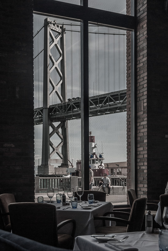
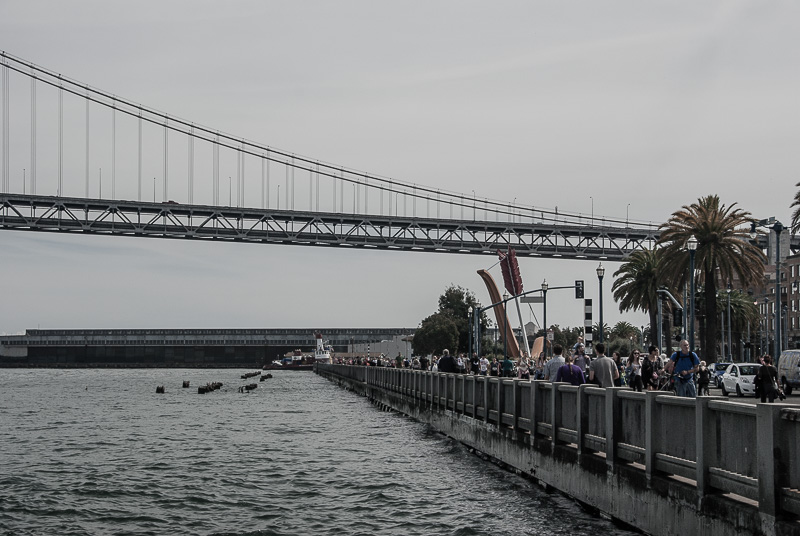
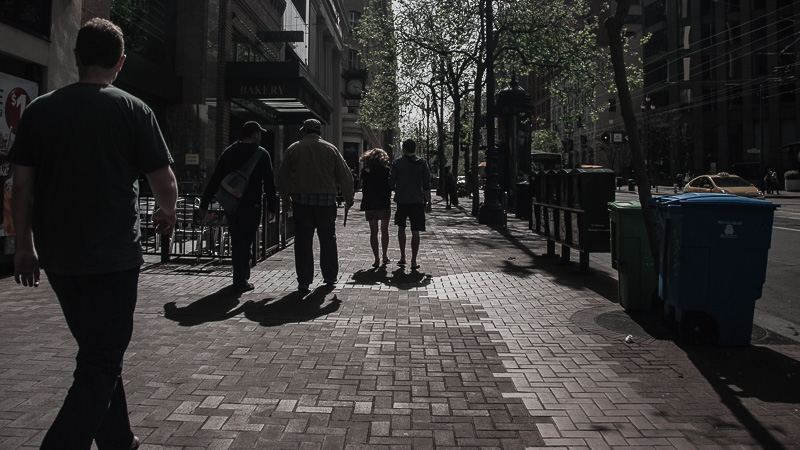
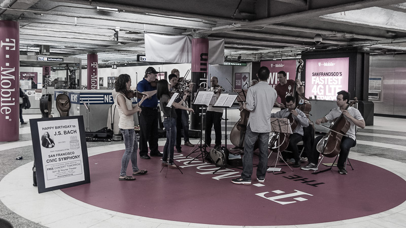
There's the restaurant shot, for example. Then a few from Pier 14 (don't even think of trying to find a parking place nearby). Then some shot walking up Market St. (which you would not have done if you had found a parking place). And finally that free concert in the Metro station.
These aren't shots of the unseen city so much as the city seen from the soles of your feet.
UNITED WE STAND
We wanted to unify them despite their varying subjects, so we applied a few presets to them in Lightroom. We realize presets are extremely popular but we never like what they do to our images for some reason. It isn't so much they seem culled from Creativity for Dummies as it is that they take all the fun out of the edits for us.
The fun is fooling around. Failing to improve on things. Changing direction. Trying something completely different. Making more coffee.
Realizing the Bach sounds suspiciously like mortuary music.
For our prints, we had nice color images like that Cityscape we showed you earlier this week. They stand alone. But not together.
Our first thought was to go monochrome. Black and white.
We did that. It isn't hard. One click of the mouse and the whole set slipped back 50 years into black and white. And that worked to unify them.
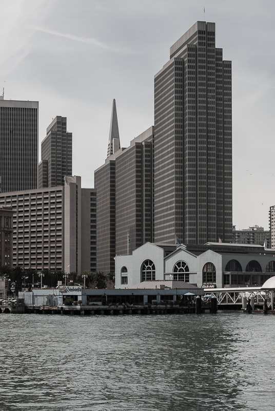
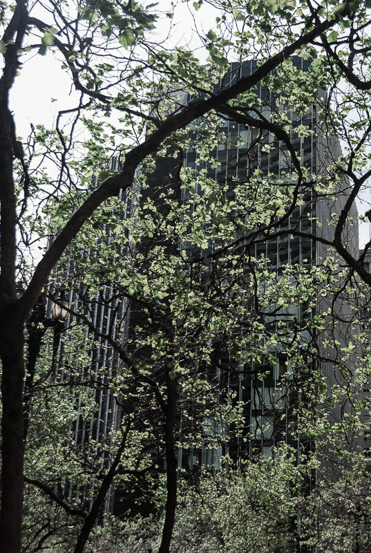
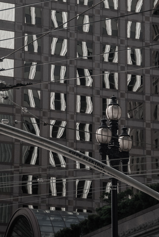
But, you know, we missed the color. In that restaurant shot, for example, the red on the tug tells you its the Fire Department's tug. In the shot of the bridge and the crowd along the wall, it highlights the bow and arrow. In the skyscraper shot, it emphasizes the Ferry Building's blue, Yerba Buena Island in the next. The leaves of a tree, even the T-Mobile advertising in the Metro station.
It functions, in short, in most of the images.
ROCK, HARD PLACE
Color dispersed the collection, black and white lost information. What to do?
Compromise. You know, the lost art.
We almost never touch the Saturation slider (not for a Raw file, but those digicam images tend to need the correction). But that was the trick this time. We were inspired by the fog, which diffuses the light and tones down the color.
It was unfathomably difficult to hit just the right spot, though.
The images had to match. They had to show a hint of color. Getting just a hint in sunlight is not the same as getting a hint in shade. Or under artificial light. So we used a variety of Saturation settings.
Except for the last shot at ISO 800, everything was captured at ISO 100 on a Nikon D200 with the 18-200mm zoom and a polarizer.
They did have that in common.