Photo Corners headlinesarchivemikepasini.com
![]()
A S C R A P B O O K O F S O L U T I O N S F O R T H E P H O T O G R A P H E R
![]()
Enhancing the enjoyment of taking pictures with news that matters, features that entertain and images that delight. Published frequently.
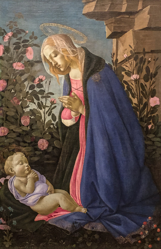
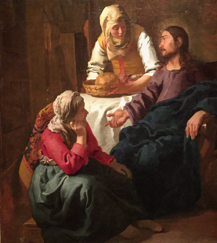
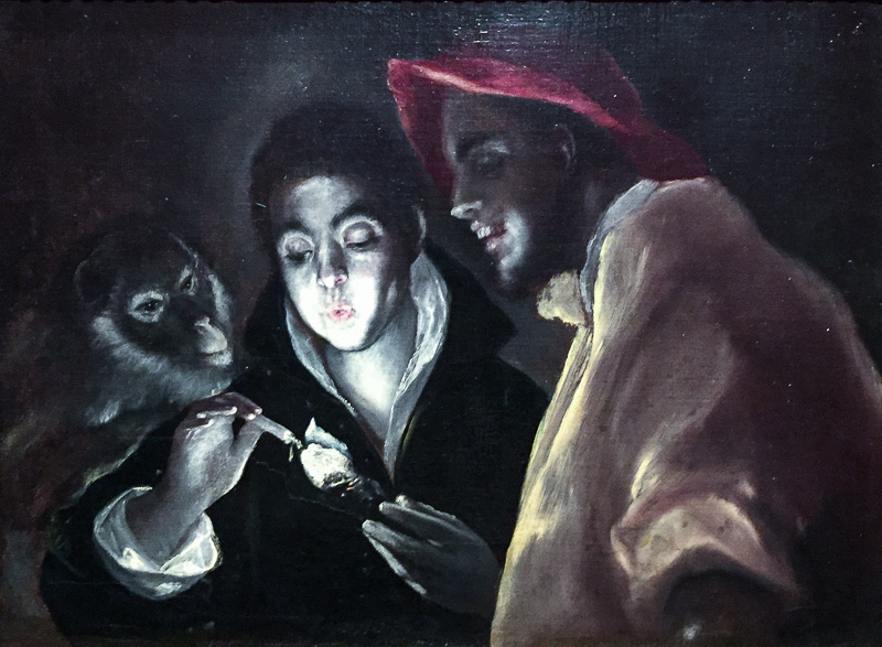
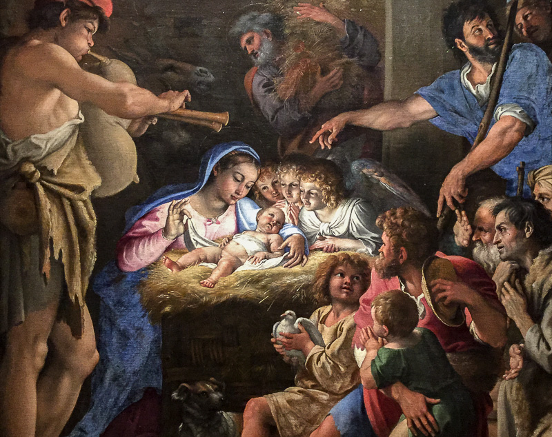
Friday Slide Show: Botticelli to Braque


1 May 2015
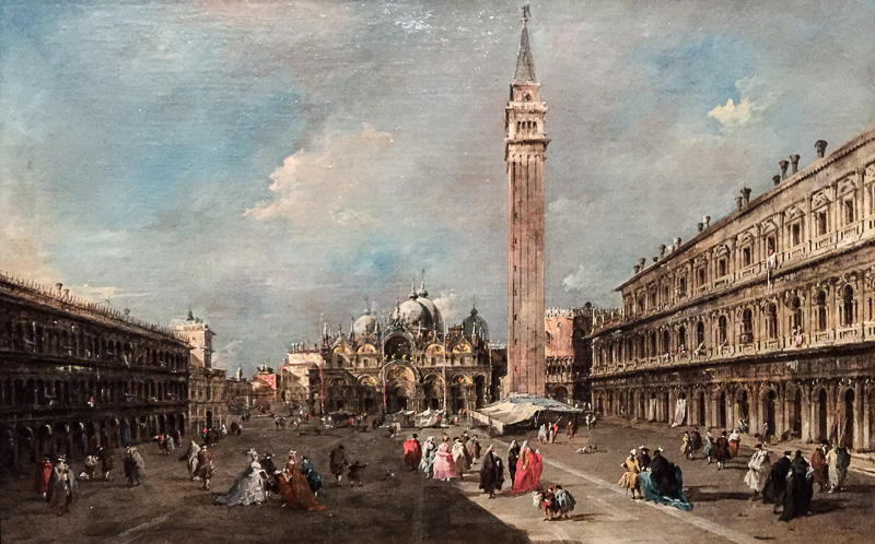
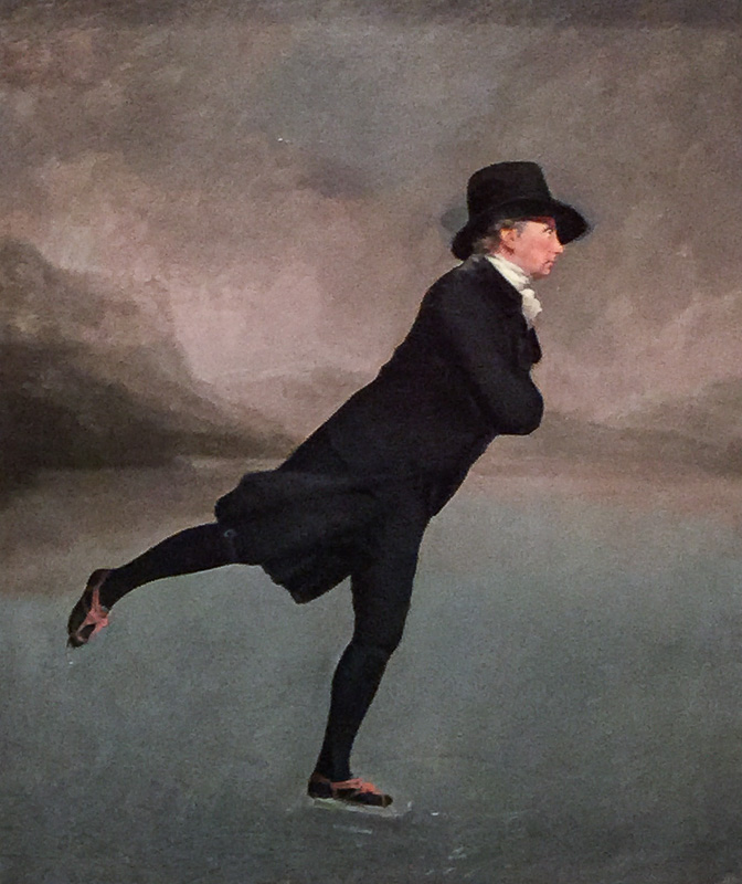
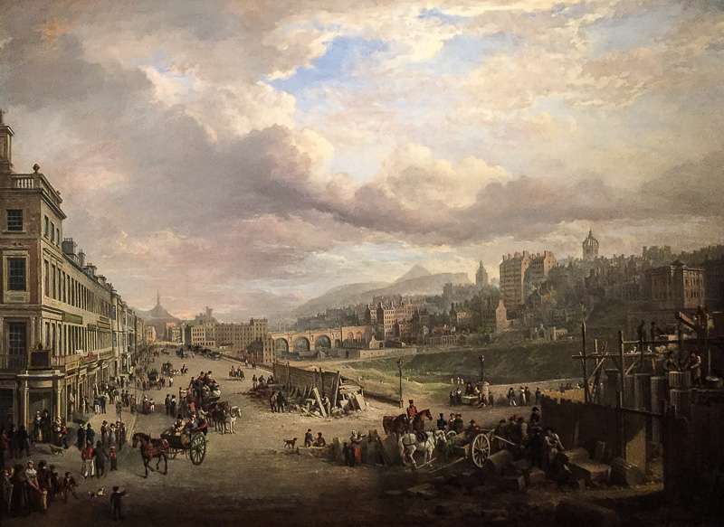
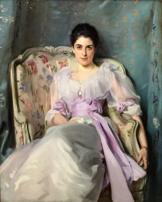
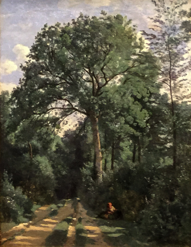
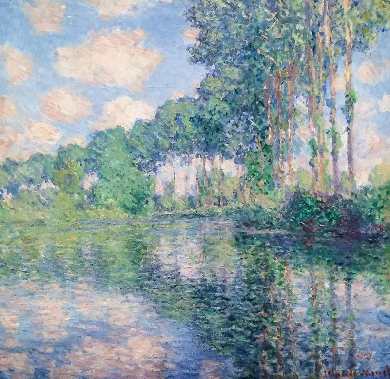
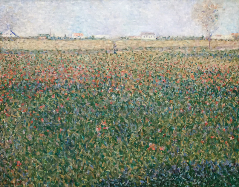
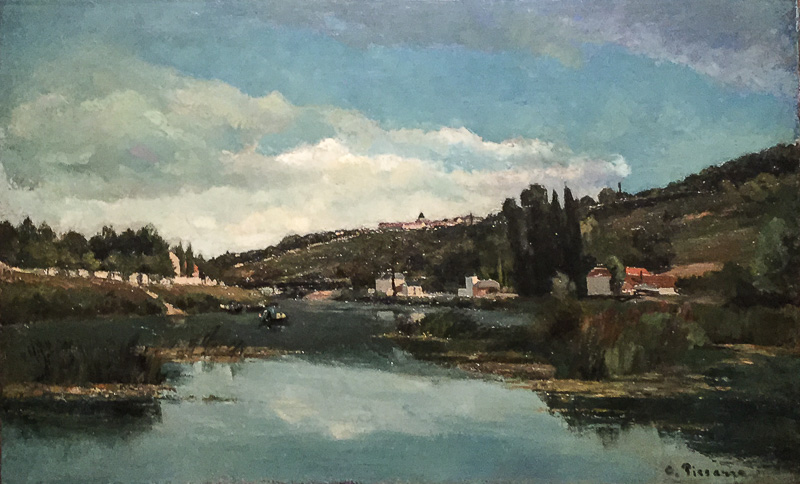
Through May 31, the de Young Museum is exhibiting Botticelli to Braque containing works from the National Galleries of Scotland that span a range of over 400 years. Painters include some familiar names, like Sandro Botticelli, Diego Velázquez, Johannes Vermeer, Rembrandt van Rijn, Sir Henry Raeburn, Frederic Edwin Church, Claude Monet, Paul Gauguin, Georges Seurat, Pablo Picasso and Georges Braque.
It's a dimly lit exhibit though and, as we mentioned in Two Cameras At The Museum yesterday, we tackled it two ways. First we used a dSLR and fast prime and then we went back with a smartphone, which could have been a wee bit smarter.
By "dimly lit," we mean a light value of 4.9 as metered by both cameras.
But today's slide show presents just the iPhone images, which were 3264x2448-pixel captures at f2.2, a stabilized 1/15 second and ISO 250.
We say "were" because the JPEG captures, in themselves, didn't do the whole job. We spent a lot of time in Lightroom CC making these thumbnails presentable.
LENS CORRECTIONS
We started with the Lens Corrections pane to manage the distortions our orientation to the paintings and the wide angle lens introduced.
The first job was to use the Upright tool to square them up.
We had tried to shoot them square, often holding the camera over our head to minimize the distortion on the larger canvases, but without a tripod and grid to frame by, our efforts were doomed.
But because the distortion is only in two dimensions, the Upright tool didn't have to break a sweat to square them up.
The next thing we did was Crop the images so the frames were eliminated. Even with the Upright tool, we weren't going to get perfectly squared images (we rarely managed to center the images, in short), so we masked the imperfections with a tight crop.
We also enabled Profile corrections because Lightroom knows about the iPhone 6 Plus.
BASIC ADJUSTMENTS
With that done, we moved on to the Basic Adjustments pane optimize exposure. A JPEG doesn't provide a lot of headroom, but it does provide some.
We found most of the images were a bit too rosy, so we shifted the White Balance in the other direction slightly. It was odd lighting and we should have taken a shot of a WhiBal with the iPhone.
And we increased Clarity and opened up the Shadows a bit on them all, too. We also darkened the Blacks because the iPhone seemed to lighten them on all the images.
One thing we did not do was repair the shine you can see on a few of them near the top of some of the images. The paintings were illuminated with spotlights and the bright spots were caused by the light reflecting off the shiny oil paint.
TWO SLIDE SHOWS
You're seeing the sRGB exports in this slide show. But we thought we'd also temporarily make the Collection public so you could see how Lightroom CC presents them.
We say "temporarily" because as soon as we stop syncing this Collection in Lightroom, the URL will disappear. So if you're coming upon this story much after it was published, it will no longer be available.
ENJOY
It won't surprise us if we return to the exhibit to try this again. But one thing we know already is that the smartphone is a wonderful aid to enjoying the exhibit.
Not everyone can get to know an image by sketching it but taking a photo with a smartphone is not too difficult. You take home with you something to revisit that will only increase your appreciation.
Comments
It was great to see these paintings again. Most of them are familiar to me because I attended a boarding school in Edinburgh in the 1960s and used to visit the National Gallery of Scotland on wet weekends (the most common kind in Edinburgh), to look at pictures and in the vain hope of picking up art-loving girls.
As a regular gallery visitor since, I take two kinds of photographs: of the pictures themselves, as a form of note-taking and of people looking at the pictures, which I reckon makes a great subject, for a variety of formal and conceptual reasons.
Your comments on the editing of your smartphone shots contain some good implicit advice about how to photograph pictures -- any more thoughts you have about that would be interesting.
![Louvre[5].jpg](kc/Louvre[5].jpg)
![Louvre-2[2].jpg](kc/Louvre-2[2].jpg)
I have attached a couple of shots [above] taken in Paris in 2008 which look at people looking and not looking at ... one particular picture.
-- Ken Cameron
Someone should do a study on eye-time in museum galleries. We bet more time is spent reading than looking.
As for further thoughts on copying artwork, we did a better job with the Nikon D300 when we photographed Parmigianino's La Schiava Turca but that took us two tries. We profited both from using a WhiBal and an image stabilized lens.
-- Mike