Photo Corners headlinesarchivemikepasini.com
![]()
A S C R A P B O O K O F S O L U T I O N S F O R T H E P H O T O G R A P H E R
![]()
Enhancing the enjoyment of taking pictures with news that matters, features that entertain and images that delight. Published frequently.
Instagram Introduces A New Look


11 May 2016
According to a blog entry today on its site, Instagram has announced its change to the black-and-white interface it was testing last month. The new look includes a rainbow icon and a monochrome app design to avoid distracting from your images and videos.
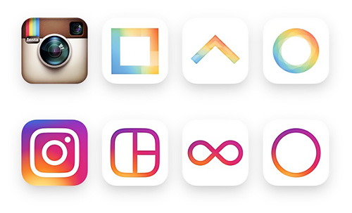
Instagram Logos. Before and after (bottom).
The story of the redesign is told by Instagram's Head of Design Ian Spalter in Designing a New Look for Instagram, Inspired by the Community.
Spalter explained why the colorful icon, a color scheme now used throughout the company's apps, does not extend to the app's interface:
While the icon is a colorful doorway into the Instagram app, once inside the app, we believe the color should come directly from the community's photos and videos. We stripped the color and noise from surfaces where people's content should take center stage and boosted color on other surfaces like sign up flows and home screens.
It's an approach we used in designing the color scheme for Photo Corners, in fact, using a black, white and grays with one highlight color for our text and graphic elements so the color images would stand out on the page.
Reaction to the change has been near universal panic and tearing of toupees with wailing of pretentious design expertise. But, you know, as they say, "The more things change, the more they stay the same." Or as they used to say, "Plus ça change, plus c'est la même chose."
To acclimate yourself to the updated design, watch this video (repeatedly if necessary) of the new icon and user interface in action: