Photo Corners headlinesarchivemikepasini.com
![]()
A S C R A P B O O K O F S O L U T I O N S F O R T H E P H O T O G R A P H E R
![]()
Enhancing the enjoyment of taking pictures with news that matters, features that entertain and images that delight. Published frequently.
Site Tweak: Index Navigation


25 August 2016
Our little left-side table of contents in reviews and longer stories has grown on us. We like its subtlety but also its persistence. A neat trick generally in life if you can pull it off.
So naturally we thought it would be a good way to navigate other long (and growing) pages on the site like the Reviews and Features indices.
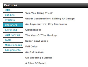
The New Design. Vertical tabs to navigate the increasingly longer listings in our indices.
So duplicated one of the indices and tried it. It was indeed pretty handy. But if we were using a phone in portrait mode, which omits that convenience, it wasn't handy at all.
Our Jump button has always had links to the various sections of longer pages in addition to links to the other sections of Photo Corners. The problem is that you have to be at the top of the page to click it open before the Jump menu will persist.
SHOW & TELL
The code, however, lets us start with the menu either hidden (as it has been) or showing automatically. So we tried showing it automatically.
That's a little bit less subtle way of navigating a page than the table of contents format. But it works on a phone, too.
But we weren't happy with how it looked. It distracted.
So late one night we experimented with tabbed panels. The reviews, already organized by type of product, were now displayed in panels by type. There was a Hardware panel, a Software panel, etc. We tried it with Features, too, but there were too many categories to fit on one line.
GO VERTICAL
So we changed the alignment to display the tabs vertically. Which is all done is CSS.
Obituaries were a little more of a challenge, but we liked how, organizing them by year, gave them a prominence they didn't have as a long list.
We used the same approach for our Matinees, organizing them by year. The only problem with breaking up long listings like the obits and matinees is that it's harder to search for a particular one.
If you use your brower's Find command, you have to search each panel now. But you can always use the site's Find button to get around that.
On second thought (and sleeping on it), we've added a Full List option to the menu that displays all the obits and matinees on one page.
OUTLIERS
The only indices that escaped the redesign are the Archive (which works well as it is) and the Slide Show (which looks prettier without tabs). On the Archive page, the Jump navigation opens automatically for your convenience. But it's just too much fun to scroll through the Slide Show thumbnails to clutter it with navigation. It's there if you need it, though. Just click on Jump.
If you're using your phone in portrait orientation, the tabs appear on the right side. There's no room on the left so we use the white space on the right. That seems to work well.
In landscape orientation you get the normal site code, as always.
ONE MORE THING
We made one other change. We're participating in a beta B&H ad program that displays a small banner ad on select indices. You won't see the ads if, as a subscriber, you elected to enable our ad blocking technology. If you aren't blocking ads, you'll see it at the bottom of each panel.
Let us know how the new tab navigation works for you. We've been using it ourselves, of course, but you out-rank us.