Photo Corners headlinesarchivemikepasini.com
![]()
A S C R A P B O O K O F S O L U T I O N S F O R T H E P H O T O G R A P H E R
![]()
Enhancing the enjoyment of taking pictures with news that matters, features that entertain and images that delight. Published frequently.
Tuesday Slide Show: Taking Our Own Advice


21 March 2017
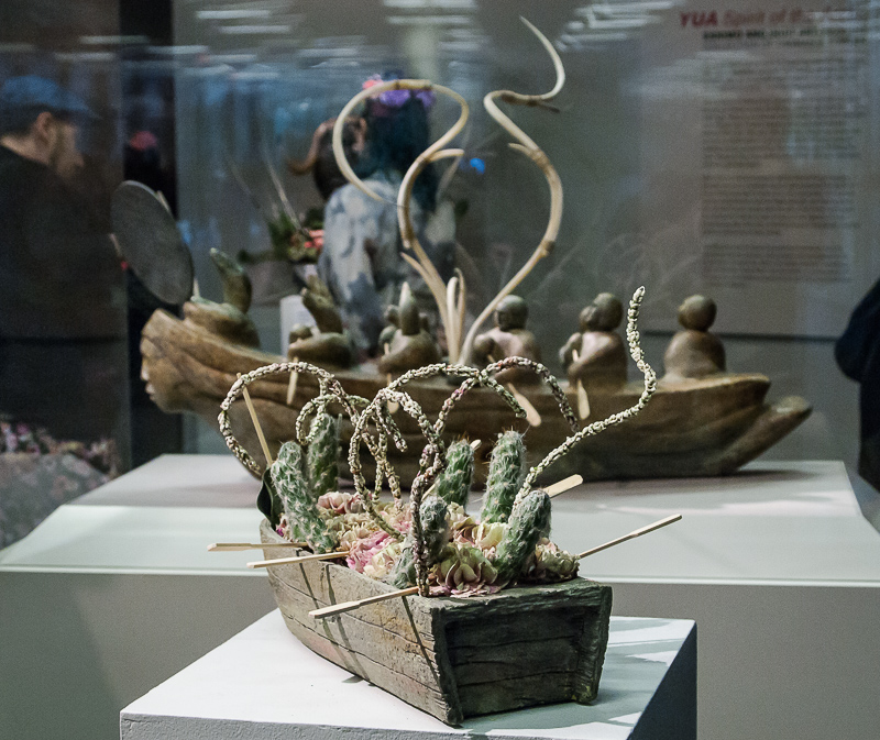
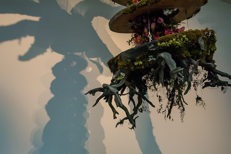
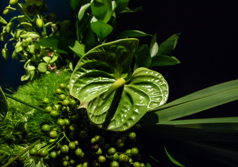
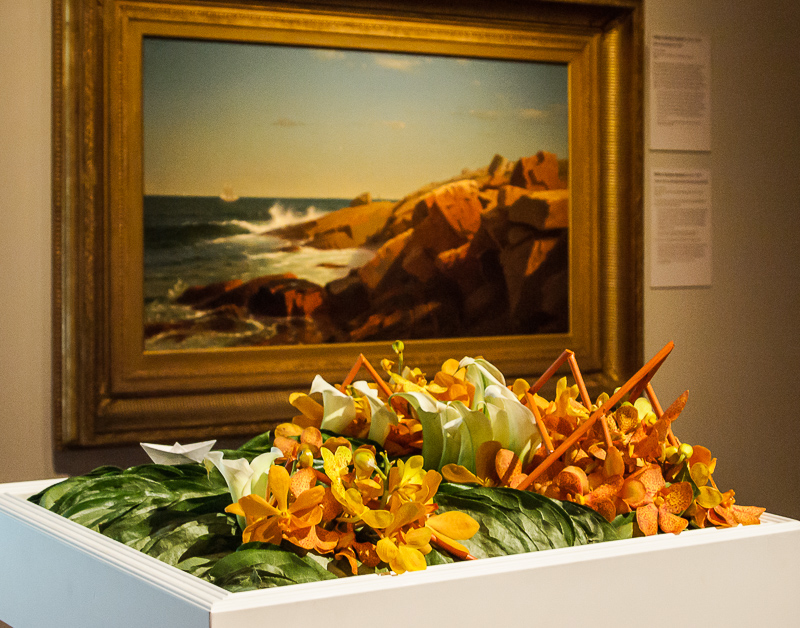
We revisited the de Young's Bouquets to Art exhibit on Saturday and this time we took our own advice. We used a WhiBal to help calculate the white balance of the museum lighting.
When we mentioned in Friday's slide show story that it was dark in the museum, we weren't kidding. The Exif LightValue tag was around 7.3 in the brighter rooms (which had skylights) and 6.3 in the more subdued rooms, going as low as 4.2 in the darker rooms where the exhibits were more sensitive to light.
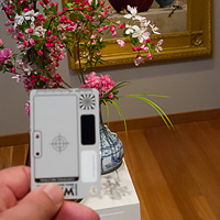
WhiBal. Just hold it in the light falling on the subject.
Inevitably, the images shot in the darker rooms are going to be, uh, "interpretive" when it comes to depicting color. Our brains may be able to see the red in a flower despite the darkness, but our camera sensors think we must be kidding.
We shot the WhiBal in three rooms where the images were important to us and, we felt, the light a little tricky. We made sure to hold the WhiBal in the light of the spotlight falling on our subject rather than the ambient light of the room.
Back at the bunker, we used Lightroom's White Balance tool set the white balance of those shots to the WhiBal's digital gray and we saved that as a White Balance preset.
While it was nice to have a one-click solution rather than futzing with the color temperature and tint sliders, neither approach overrides your own preference. There's always more than one way to do it.
You may, for example, prefer the version below on the right for its cooler, more neutral, color. Or you may prefer the one on the left for its warmer color.
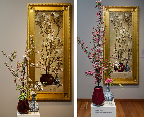
Comparison. Interpretive (l) compared to WhiBal versions.
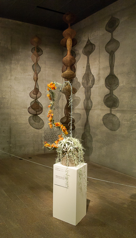
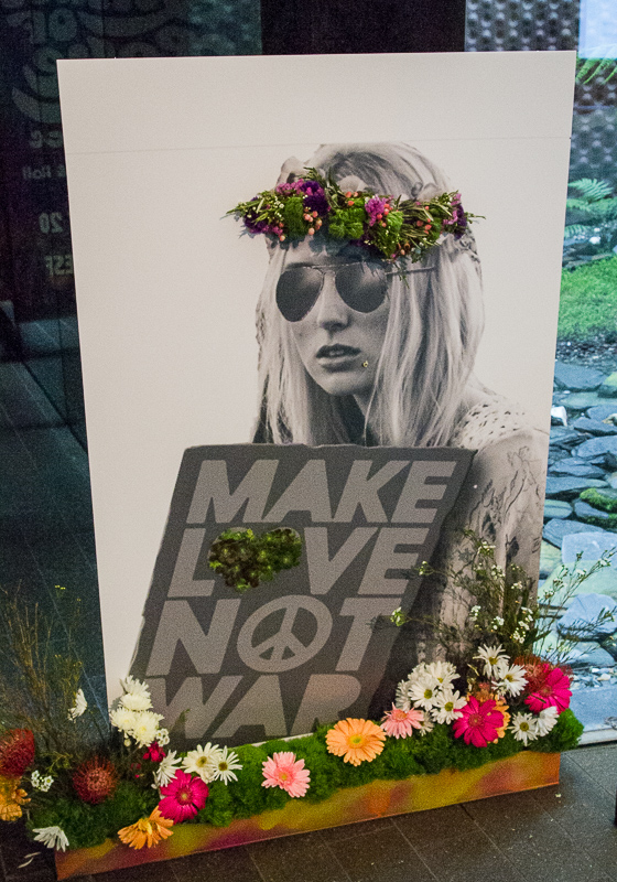
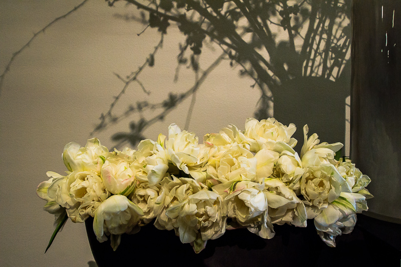
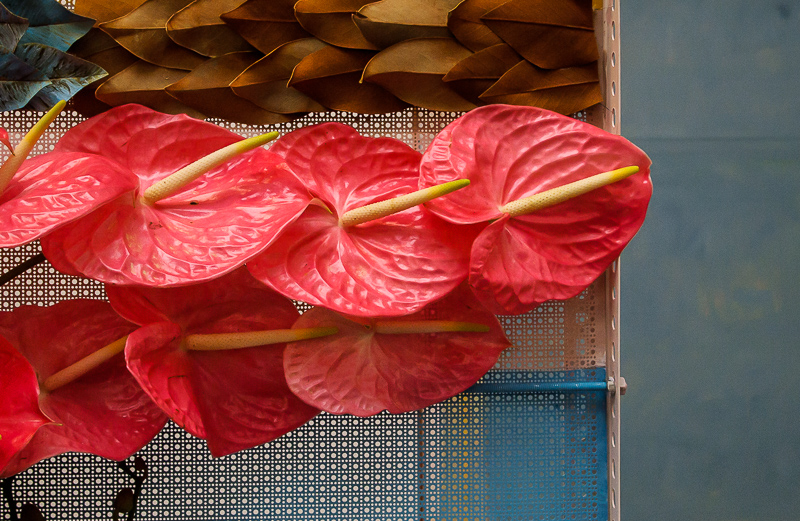
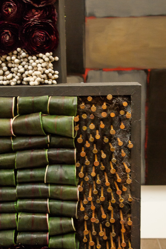
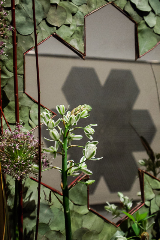
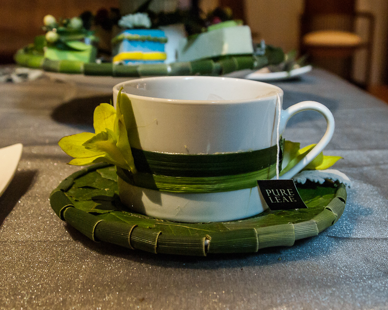
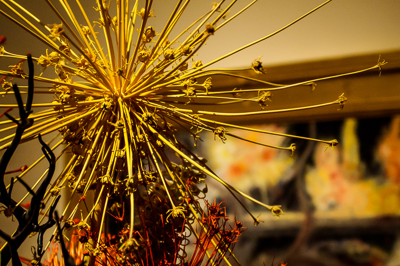
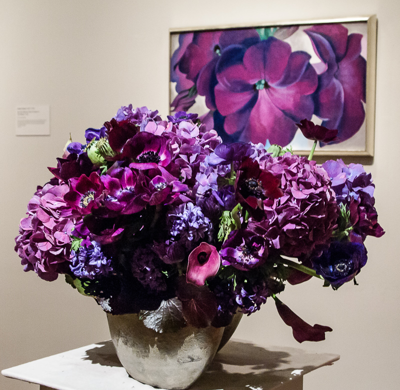
We also took a slightly different approach this time around, focusing more on details than the overall look of the bouquets. That can strip the context of the artwork itself from the image, making it less meaningful, but we found it often stood pretty well on its own.
Plus you get another set of images to enjoy. As before, we've only picked a few favorites for our slide show and put the whole set of keepers on Google Photos for you to enjoy.
We edited a couple of the Google images using Google Photos online. And we subsequently re-edited a few in the slide show using Lightroom CC, so the duplicates aren't necessarily equivalent. But, as always, we hope they're instructive.