Photo Corners headlinesarchivemikepasini.com
![]()
A S C R A P B O O K O F S O L U T I O N S F O R T H E P H O T O G R A P H E R
![]()
Enhancing the enjoyment of taking pictures with news that matters, features that entertain and images that delight. Published frequently.
Friday Slide Show: Italy In 1999


26 May 2017
And now for something completely different. We rummaged through the closets at the old ancestral home looking for a set of negatives from a trip to Italy our parents took in September and October 1999 to celebrate their 50th anniversary.
There were seven rolls of film tucked into those paper folders one-hour labs used to provide with a set of double prints. With a bound leather album showcasing the best of them on the coffee table in the living room, they hadn't seen the light of day in years.
That's why it took an afternoon to find them.
SCANNNING
When we got them back to the bunker, we checked the film type first of all. Printed along the top of each strip was a repeating identifier. We found two types: Kodak Gold 200-5 and Kodak Gold 200-6.
The 200-5 film is Kodak Gold Super 200 Generation 5 and the 200-6 film is Kodak Gold 200 Generation 6. Those are different emulsions and VueScan, which we used to scan the film, knew the difference in color sensitivity.
Armed with the information, we got to work. We used the OpticFilm 135 to do the scanning, loading each film strip, Previewing the images in VueScan to rotate them and refine the crop and then Scanning them. During the Scan (which just writes the already scanned film data to disk), we removed the holder from the scanner and loaded the next batch.
So we made quick work of it but it took a few sessions.
The scans themselves were 4883x3532 pixels. And while we did use compressed air to clean off any lint, they film had the usual defects from handling in the real world. Spot and threads, that is.
Our plan was to display them on Mom's new 27-inch retina iMac as part of her 90th birthday celebration. Full screen. The monitor has a resolution of 5120x2880 so that's about right.
As we previewed them in VueScan we were impressed with the color balance and detail. We'd expected to edit the 140+ images in Lightroom but we thought better of it. They didn't need it and we didn't want to impose a 21st century veneer on them.
Until today, anyway.
PRESENTATION
We didn't see them in all their glory, in fact, until we showed them to Mom. And, contrary to our previous experience with Apple Photos slide shows, the Ken Burns effect not only provided appropriate music but the pace was just right too.
We hadn't used the Ken Burns preset because we hadn't wanted to crop the images with pan and zoom (which is what the Ken Burns preset is all about). But in this case, we didn't mind a little cropping.
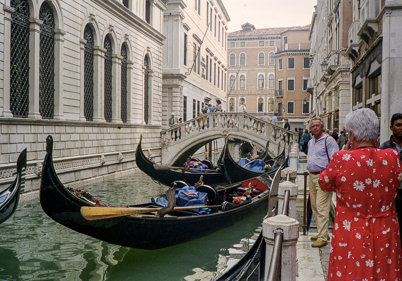
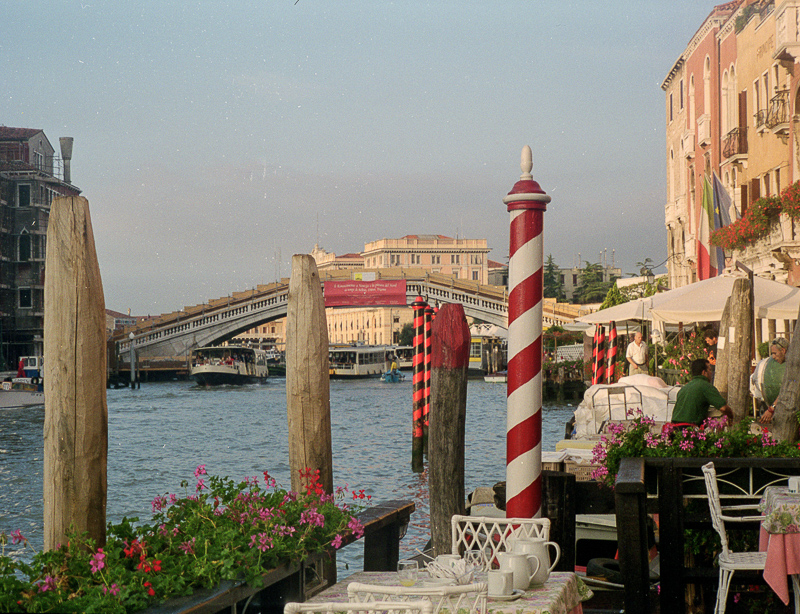
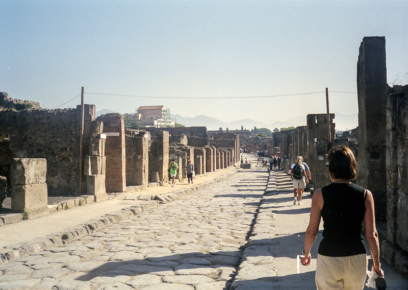
That's because these images were taken with a Canon Sure Shot Autofocus film camera with a 38mm f/2.8 lens. It's a rangefinder, so composition is not as precise as you might expect.
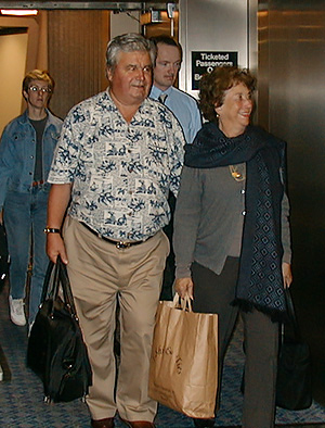
Returning Home. After the trip to Italy.
The effect of seeing these 18-year-old images on the new iMac screen was enthralling. They were taken from the point of view of a person walking down the street or riding in a bus, nothing fancy. But that meant that you felt yourself walking through the streets or looking out the window. You fell into the scene.
EDITS
Which brings us to today's puny 800-pixel selection of just 19 of them edited in Lightroom.
Why did we do that?
We thought it would be interesting to apply modern post processing tools like the Upright tool to a few of them. And we thought more aggressive crops on a few would make a better image.
It was a little like putting on new shoes to go to a dance.
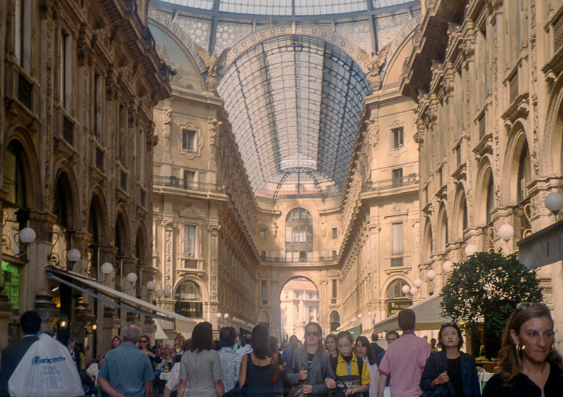
We found that the Upright tool had to be used in moderation. With a 38mm lens pointing up in a narrow street, there's only so much you can correct before the correction itself looks like a distortion. So the image facing the Duomo in Milano still has converging verticals, as does the Duomo in Firenze.
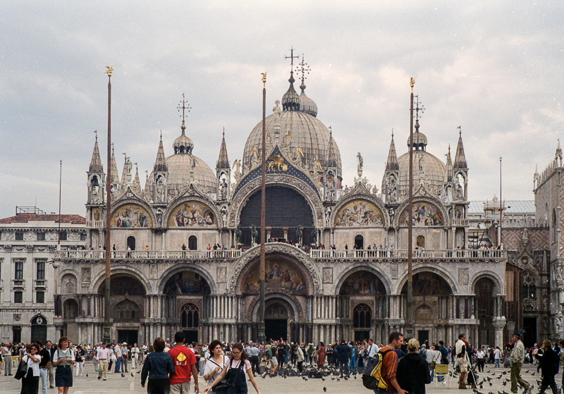
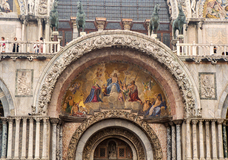
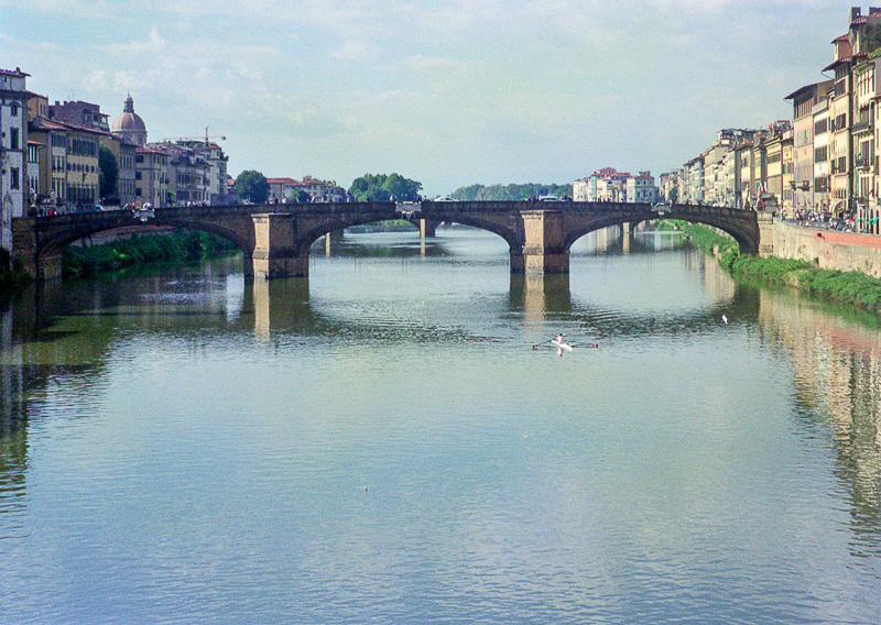
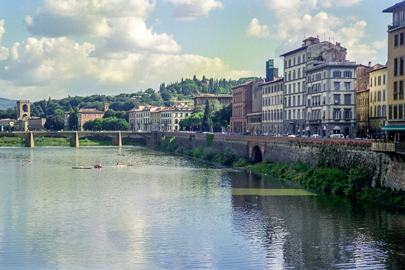
But we were able to throw the full Upright tool at the facade of St. Mark's Basilica in Venezia. And the bridges over the Arno in Firenze.
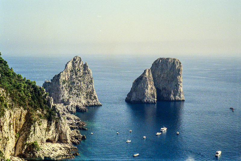
We stuck to worrying about the composition not the color. We rather liked the color, which conveyed very nicely the quality of light at different times of the day. The Galleria in Milano, for example, has an atmospheric haze that would have been ruined by the Dehaze tool, although that came in handy for the seascapes.
CIAO
We watched the show four times that night with Mom. And while this slide show is but a shadow of that presentation, it still provides a glimpse of a beautiful place that you can enjoy wherever you find yourself.
Leaving Italy is always sad, but bringing the memories to life again with a few images was a delight. Like Ciao -- that Italian word that can be used to say goodbye or greet someone -- what matters is what's right in front of you.
