Photo Corners headlinesarchivemikepasini.com
![]()
A S C R A P B O O K O F S O L U T I O N S F O R T H E P H O T O G R A P H E R
![]()
Enhancing the enjoyment of taking pictures with news that matters, features that entertain and images that delight. Published frequently.
Site Tweak: Carousel Navigation


23 July 2017
Two in the morning. Awake. Roll over. Still awake. Repeat for half an hour. Still awake. The only solution: get up, go down to the bunker and write some JavaScript.
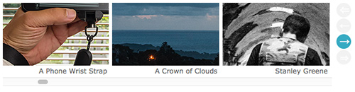
Carousel Navigation. There's always been a scrollbar and gesture support but now there's a little more obvious hint of what you can't see with the ability to jump three at a time or to one or the other end of the list.
JavaScript always exhausts us. Toss in a little CSS to make it restful.
We'd had a sneaking suspicion for a while that our carousel of thumbnails at the top of each of our headline pages looks a bit too static. How would you know it scrolls?
Well, if you have a mouse attached to your device, there's a scroll bar. And that's the system setup we used during development.
But if you don't have a mouse (maybe you have a trackpad or a touchscreen device), you won't see the scroll bar. You'll just see three thumbnails. Like that's all there is.
But there's a lot more.
On the headline pages for each year, every thumbnail we used that year appears. There were 189 in 2016, for example. On the main headline page, they span the highlights of our entire publication history. That's 293 at the moment (even after we delete a few each month).
So how could we indicate there are more there than meets the eye?
DISPLAY
In many carousels, there's an overlay of previous and next arrows. We could do that, sure, but we didn't like the idea of overlaying the small thumbnails. It just seemed like noise to us.
But we have a little room in the right margin, so we thought about how best to make use of that.
Two in the morning is not a great time to hit on a brilliant solution. But it's very effective at coming up with all the dimmer approaches.
Two in the morning is not a great time to hit on a brilliant solution.
We went through a variety of control displays but kept circling back to what we use for the slide shows and what you may know from video controls.
We were blatant about them at first, then we hid them until you moused over them (much like Apple) because we didn't like looking at them, frankly.
But if you can't see them, they're no better than the invisible scrollbar you can't see now. So we displayed them but dimly. When you mouse over them, they light up.
We started with buttons but that was really ugly. So we moved to anchors but the text itself wasn't sufficient except for our initial display. Then we added a background with a border radius that forms a circle. That we liked.
The usual arrow symbols don't quite center in there so we used some unusual arrow symbols that fit better.
JAVASCRIPT
The JavaScript was simple, although (true to form) less than elegant.
It was simple to apply a
onclick="document.getElementById('carousel-tiles').scrollLeftwith a+=or-=and some value to an HTML anchor tag.The inelegant part is the function name of
scrollLeft. It should properly be namedscrollHorizontalbecause 1) there's noscrollRightand 2) it goes left or right depending on the value. Negative numbers go back.The scroll value is in pixels. With about 300 (and growing) thumbnails that are 190 pixels wide with a 6 pixel buffer, we had 58,800 pixels to deal with.
To make sure we made it to the end while allowing for future growth, we set the jump-to-end/beginning value at 100,000. If you exceed the actual number of pixels, you just go to the end (which is, we have to admit, kind of elegant).
For the small jumps, we started with 196 pixels, which moved things along a thumbnail at a time. But life is short. So we jumped three at time, which makes the previous/next controls a bit more useful.
The inter-thumbnail white space is not hard coded so we found ourselves getting slightly out of alignment after a few clicks. But we found that a small price to pay for the new functionality.
So instead of just the usual previous and next buttons, you also get a first and last thumbnail. With so many thumbnails being able to scoot to the beginning or the end to begin jumping around is helpful.
Although, you know, nothing beats that scroll bar (or a gesture for that matter).
CONCLUSION
This was a tough one.
We didn't want to clutter up the home back with more stuff but we wanted to clue you in there are more than three thumbnails. By just hinting at the controls, we hit something we can live with, although we really did prefer the hidden controls. Even if they make no sense at all.
The JavaScript was remarkably simple. There are huge libraries to do this but one simple command was all we needed.
We worked on this until we liked it. And we liked it enough to deploy it on all the headline pages.
We hope you find it useful. As always, let us know what you think using the Feedback button below.