Photo Corners headlinesarchivemikepasini.com
![]()
A S C R A P B O O K O F S O L U T I O N S F O R T H E P H O T O G R A P H E R
![]()
Enhancing the enjoyment of taking pictures with news that matters, features that entertain and images that delight. Published frequently.
Friday Slide Show: Winter Light


8 January 2021
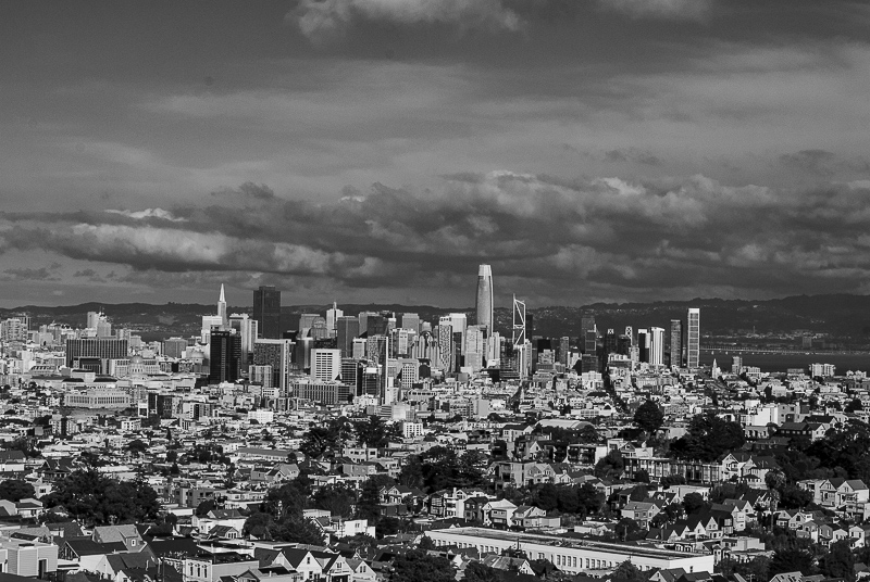
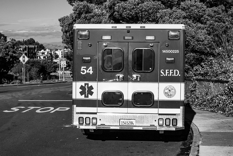
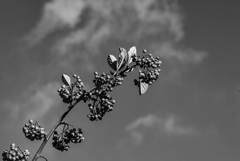
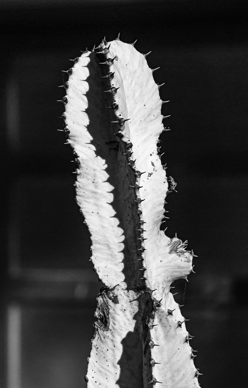
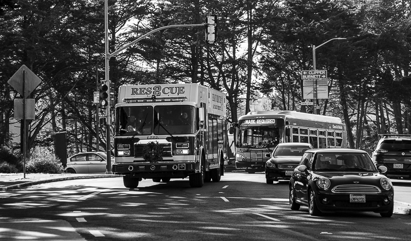
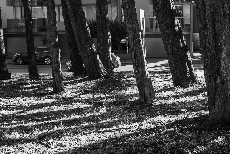
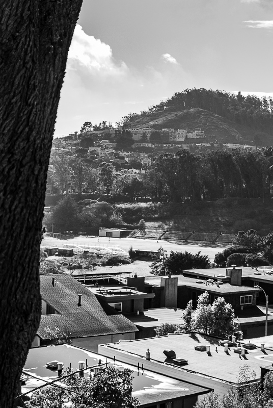
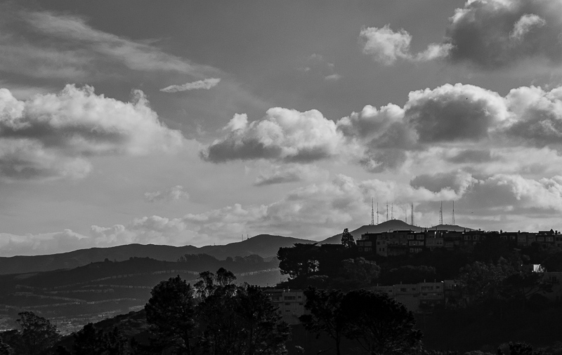
Last week as the year was expiring in winter's hard light, we took a familiar if chilly walk up Portola to where Market St. starts at the foot of Twin Peaks. There's ~a nice view of the city~ () there so we took the lens cap off and fired away.
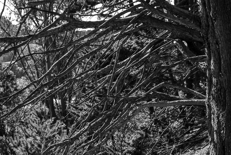
And we didn't put it back on as we walked back down Portola. Everything looked different. Intrigued, we lined up shot after shot. Some worked, some didn't. But we had fun.
That wasn't even half of it though.
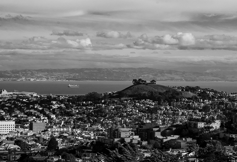
The color charmed us on the cityscape but for the suite of images what struck us was the tonality. So we converted them to black and white.
We didn't discard the color information, though. We used it to inform the tonalities.
Our blues became darker, our greens lighter. Then we pushed our Shadows open and closed down our Highlights to get more detail there. When we liked the treatment on the cityscape we synced it to the other images.
We ended up with something that could be mistaken for a preset applied to all these images.
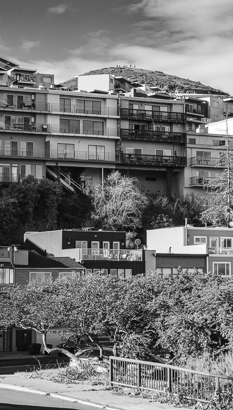
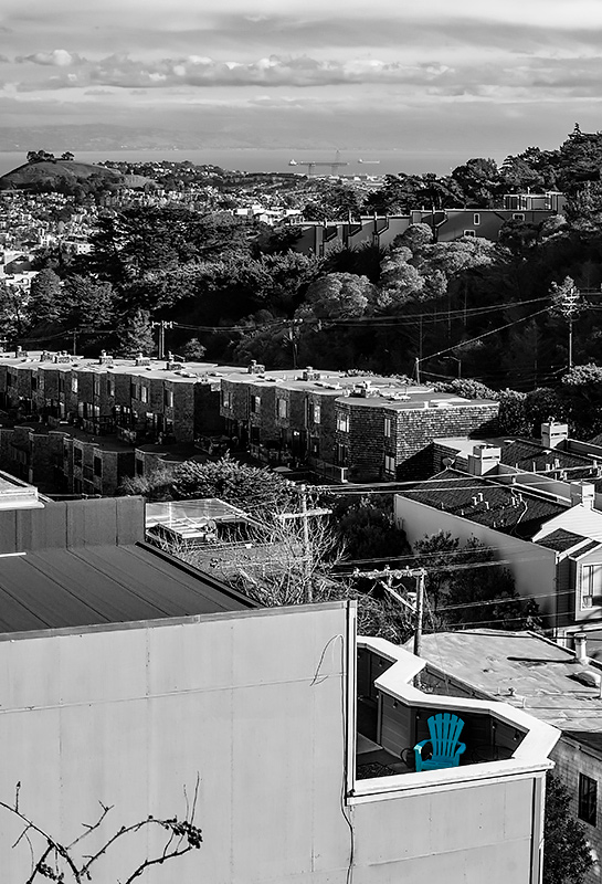
We did try a few presets first, in fact. But we didn't like the tradeoffs. If the sky had enough contrast, the trees were black blobs. If we had some life in the trees, the sky was flat. Each preset seemed to sacrifice something.
Presets are one-size-fits-all adjustments. Our images looked better in tailor-made adjustments.
When we adjusted the color and tone sliders after cheating the hues one way or another, we could lean into one effect without spoiling another. We went through each image, tweaking the tones.
And, yes, that was a lot of fun, too. And in the warm confines of the bunker a good deal more comfortable than the cold winter air.