Photo Corners headlinesarchivemikepasini.com
![]()
A S C R A P B O O K O F S O L U T I O N S F O R T H E P H O T O G R A P H E R
![]()
Enhancing the enjoyment of taking pictures with news that matters, features that entertain and images that delight. Published frequently.
On Reflection


27 October 2021
At Adobe MAX yesterday, we were treated to an interview with graphic designer David Carson. We enjoyed both his work and how he talked about it. But there was one thing he said that we didn't buy.
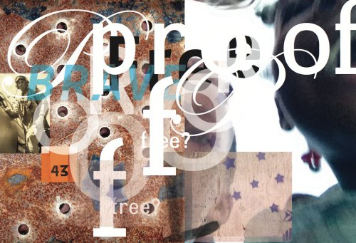
David Carson. Commissioned work for the Smithsonian Institute, Washington DC, June 2014.
He didn't feel that his work represented a style.
For a designer, that's probably a good situation to find yourself. Oblivious to your style. But those of us not engaged in the work, the style is unmistakable. It's what leads clients to you, after all. They like your style.
So what is Carson's style?
DECONSTRUCTION
This is where the plot thickens for photographers. Like graphic artists, photographers are in the eyeball competition business. We compete for the attention of viewers.
We are assaulted, in fact, by visual stimuli to the extent that almost none of it registers. We see it without looking at it.
That explains why so many cars shoot right past the stop sign at our corner. Distracted by the oddly unaligned intersection, they just don't see it. Not even the limit line or word "Stop" painted on the street.
Carson's style is to deconstruct a graphic message, to confuse us the way reality does, so we look at it, try to figure it out, put it back together. So we spend more time with his image than we normally spend on an image.
Rather than a brand name or title spelled out legibly in one font at one weight, he jumbles the letters, assigns different fonts and weights and makes you put the world together from the mess.
The colors and textures of the background are similarly scattered, torn, blown away like debris in a gutter. You have to see through them.
It's a visual jigsaw on a messy table. A style designed for our time.
PHOTOGRAPHIC EQUIVALENT
Is there a photographic equivalent? Should there be?
First, let's be clear we aren't talking about deconstruction as critical theory. We aren't looking for multiple meanings or layers of visual language. Or even, in the case of a photography, how it was made.
Those are all other meanings of the term "deconstruction."
We're talking about the presentation of a disorienting image, an image that can't be comprehended in the blink of an eye.
Such an image, if one were to exist, would attract a viewer long enough to engage them to try to solve the puzzle of what they were looking at. That's what Carson's style does.
It's hard to imagine a photographic equivalent that does not involve editing an image or compositing several images. That, after all, is Carson's technique. Tearing things up, separating them, bringing them back together again.
You don't do that in 1/125 of a second.
In 2016 the Topographie de l'Art in Paris exhibited Déconstruction Photographique with several examples. Reflections on windows and sliced prints are other examples that come to mind.
That's what it looks like.
CONCLUSION
Two dimensional graphic elements are simple compared to the 3D world we inhabit. Jumbling a book title or company name doesn't make it impossible to reconstruct, even if it makes it hard to read.
But in photography where the real world is the subject material, you can quickly slip beyond a comprehensible puzzle to irretrievable confusion.
Nobody wants to go there.
But taking a step in that direction is something to think about as you press that shutter button. There may be more in front of you than meets the eye.