Photo Corners headlinesarchivemikepasini.com
![]()
A S C R A P B O O K O F S O L U T I O N S F O R T H E P H O T O G R A P H E R
![]()
Enhancing the enjoyment of taking pictures with news that matters, features that entertain and images that delight. Published frequently.
Friday Slide Show: A Study in Treatments


23 June 2023
We had our hands full. We'd taken Joyce to Kaiser's French campus to pick up some high tech stuff for an at-home test, which we carried under our arm because she was busy with her purse and trekking pole. But we'd also picked up a box of supplies at the pharmacy there.
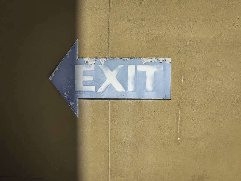
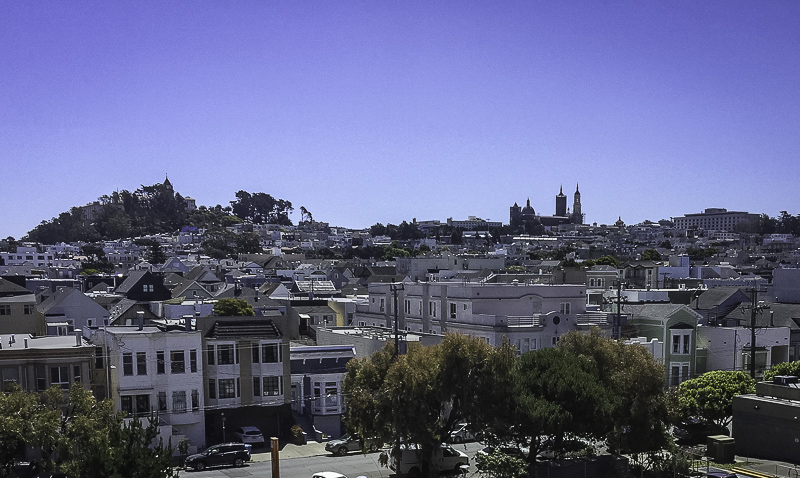
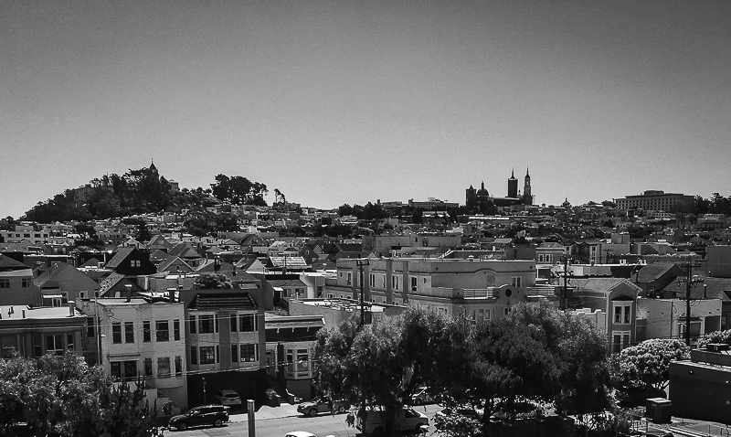
Still, we were mesmerized by what we were looking at on a gorgeously clear and bright morning in the Richmond district of San Francisco. We knew if we didn't juggle our merchandise with one hand and take iPhone photos with the other, we'd regret it.
And life is way too short to spend it accumulating regrets.
So silly as it made us look, we did just that. Put the packages under our arm and got the iPhone Camera app launched and miraculously lined up a few one-handed shots.
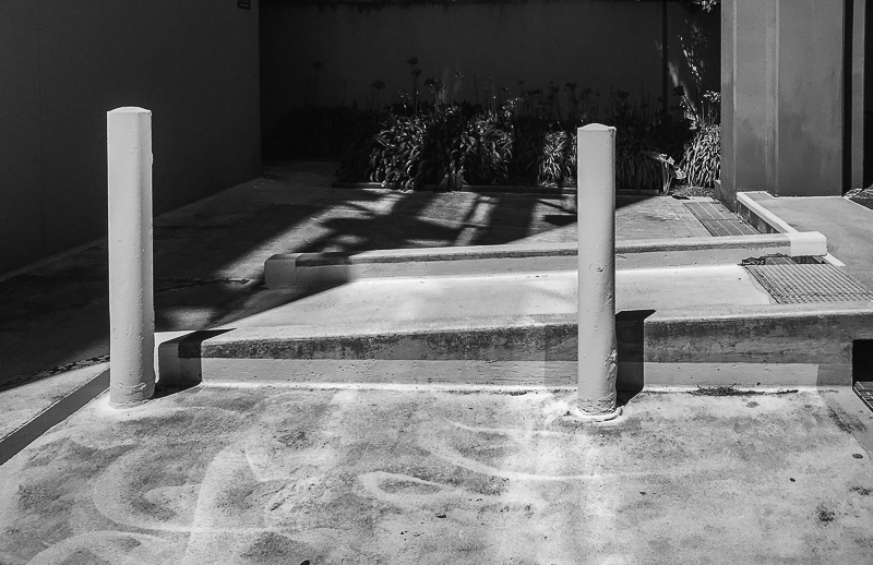
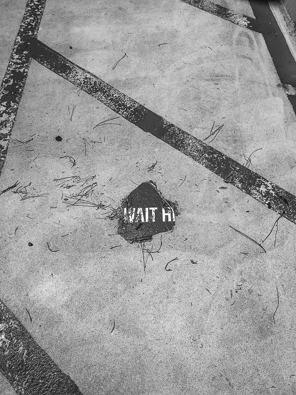
When we left French, we put the camera away. And (wouldn't you know it) we instantly regretted it when we walked over a concrete sidewalk square that, when freshly poured, had a few eucalyptus leaves fall on it, leaving an elegant impression.
We'll be back, we told ourselves. It's a hospital after all.
Back at the bunker, we couldn't wait to edit the images. We ingested them, archived them and duplicated them for editing in Lightroom.
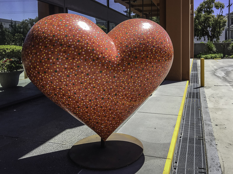
The red heart, a takeoff on the CowParade art project in various cities (Rochester, for example, had cows), demanded a color treatment. So we did them all in color. And we really liked the color.
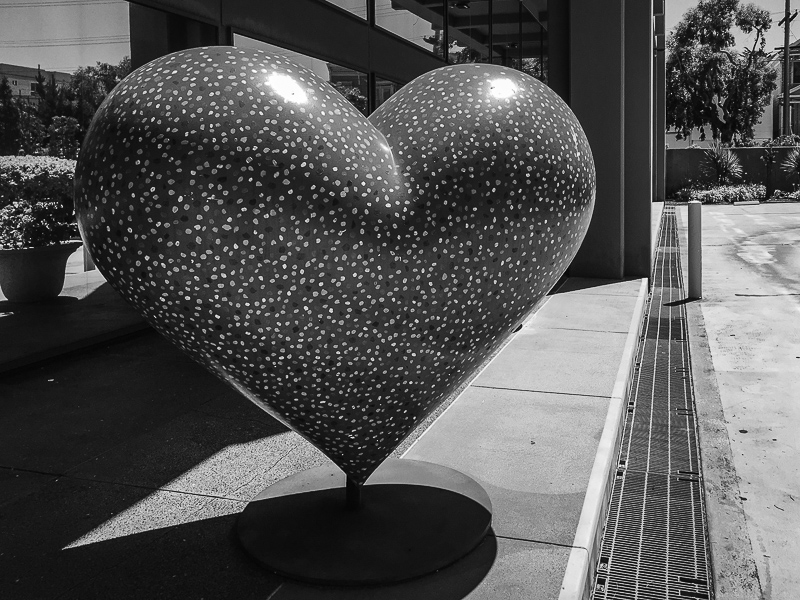
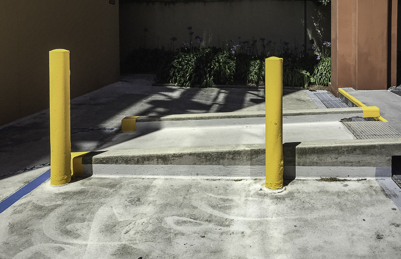
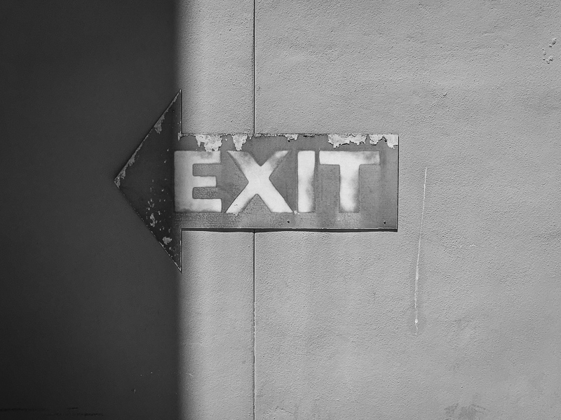
But we wanted to see what they looked like in black-and-white, too. It was a challenge. They're color images. The red heart, the yellow cautions, the blue signs, the blue blue sky.
But they had a different dimension in black-and-white that we also really liked.
The tonalities were striking to begin with but we enhanced them with various filters. A blue filter for the red heart. A yellow filter for the cityscape.
And, of course, we tweaked the Basic settings to bring out the contrast and texture a bit more.
They may be the same images but they're two different series. Two different challenges, we might say. Or, to put it another way, two different ways to have fun with the same photos.
Life is way too short not to double your fun now and then.