Photo Corners headlinesarchivemikepasini.com
![]()
A S C R A P B O O K O F S O L U T I O N S F O R T H E P H O T O G R A P H E R
![]()
Enhancing the enjoyment of taking pictures with news that matters, features that entertain and images that delight. Published frequently.
Aging A Photo With Exposure 6


9 October 2014
When Alien Skin released Exposure 6 earlier this year, we reported on its "faster imaging engine, texture control and bokeh simulation based on sample lenses." Our deeper look at Exposure 5 about a year ago is still a good way to understand what Exposure is all about.
But maybe the best way to appreciate it is to use it on a project.
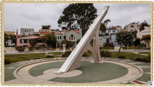
In August, we published a Friday Slide Show on a historic San Francisco sundial. We thought we just might put Exposure 6 to work illustrating the history of that unusual structure.
Exposure 6's presets include antique film emulsions covering the sundial's long life (with helpful historical notes about each emulsion when you hover over its thumbnail). And it includes a healthy range of historical papers and borders. Other film emulsion emulators are not as comprehensive.
Could we credibly take a modern image and recast it as something shot in 1913, say, or 1936? How well, we wondered, could we antique a modern image?
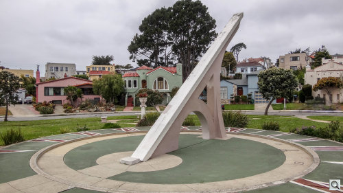
THE MODERN IMAGE
Our base image was captured in May 2012 with a Sony TX200V at f3.5, 1/400 second and ISO 64. It was ideal except for the car and a street light, neither of which would have been present in 1913. So we removed them in Photoshop CC 2014 using the Healing Brush.
With that done, we were ready to apply a few emulsions and effects. We thought we'd limit the simulations to prints on paper from the various emulsions to make it more realistic.
We also thought we'd restrict our borders to the Print section, trying to pick an era-appropriate border for each image.
To make comparison easy, open
this thumbnail and set it to the side as you scroll down.
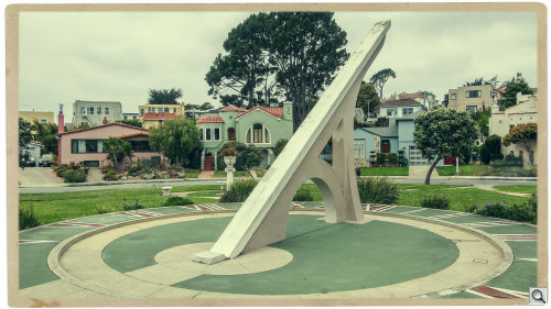
1913 WET PLATE
We start our album with one of the oldest photographic processes, the wet plate or collodion process we highlighted in our Carleton Watkins story.
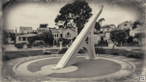
Because this technology would have seen its day by the time the sundial was built, we thought we'd let Exposure 6 throw the book at it, with its own border, distressed paper and bokeh. It's a good example of how far Exposure 6 can take an image, if nothing else.
But we like to think it's how Carlton Watkins might have photographed the sundial, if he'd lived to see it. Although this one is so distressed it would have been one that survived the 1906 fire and earthquake that destroyed his San Francisco studio.
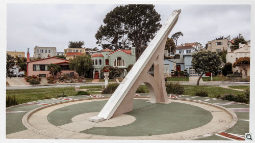
1913 MONOCHROME
In 1913 when the sundial was built, the most common photographs of the sundial would have been monochrome. A sepia monochrome would not have been far-fetched. But a split-toned monochrome would have been special.
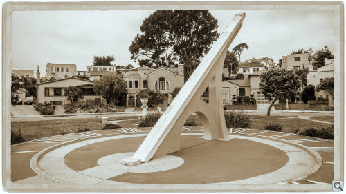
We used the Toning - Sepia/Blue (Agfa APX 100) preset with a Paper border (option 11). A print border of some kind unified the images (they would all have been prints, after all). Otherwise we avoided adding any effects.
Grain, for example, wouldn't have been evident in a contact print. And dust is the domain of the negative, not the print. Scratches or spots would have worked on the print, but we didn't want to indulge in that sort of drama. We just wanted to see what an old print might have looked like.
The sky is gone, as it would have been on an orthographic emulsion. We didn't have to simulate that.
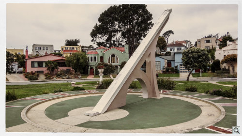
1913 AUTOCHROME
The only color image that might have been made in 1913 would have been an Autochrome, using a process patented in 1903.
Louis Lumière's process filtered light with a single three-color screen composed of millions of grains of potato starch dyed in three different colors. The mixture was then laid out on a varnished glass plate, which was ready for use after it had been coated with a black and white emulsion.
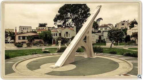
The color in our image is quite muted, especially the blues. The pastel palette is pleasantly warm, though, in what is not much different from a monochrome image.
1936 KODACHROME
When Kodak came up with Kodachrome, it took a new approach to capturing color, using a subtractive color method. A version was marketed as early as 1915 but this rendition is based on the 35mm emulsion released in 1936.
It's not a bed rendering of the scene, the color recognizable and not false, if a little subdued.
1936 AGFACOLOR NEUE
Unlike the Kodachrome tri-pack process, the color couplers in Agfacolor Neue were built into the emulsion layers, which simplified film processing. Modern color films avoided the Kodachrome approach in favor of Agfacolor's.
The color is not accurate in this rendering but it also appears to have been aged.
1942 KODACOLOR
Kodak's development of Kodacolor in 1942 brought us the first color negative film for making color prints. There have been a lot of variations in the emulsion, all with their own names, over the years. You've probably used a few of them yourself.

Here, we've used Alien Skin's faded Kodacolor to show how the prints would appear now.
1961 KODACHROME II
When Kodachrome II came out in 1961, it delivered a much more accurate color palatte. In fact, it's a lot like the base digital rendering.
That's certainly reflected in this version.
1972 POLAROID SX-70
Polaroid had developed an instant film long before this SX-70 emulsion, but the process was tricky, requiring the photographer to pull the image pack from the camera, time the development, peel the developer sheet off cleanly and coat the final image.
The SX-70 film was ejected automatically from the camera and developed quickly without any residue or coating required.
Here we've applied a simple white border, much as you would have seen on an SX-70 print but the aspect ratio is our modern 16:9 to facilitate comparison.
CONCLUSION
We found Exposure 6's rollover help a great help in picking suitable emulsions for our historical recreations. But we were able to go even further in aging our image with Exposure 6's papers and borders.
We could have distressed the images (and did distress the first image as an example) but mainly we restricted our special effects to fading.
After looking at these for a few weeks, we think they're pretty convincing. You can age a photo with Exposure 6. Not only that, but it's a lot of fun, too.