Photo Corners headlinesarchivemikepasini.com
![]()
A S C R A P B O O K O F S O L U T I O N S F O R T H E P H O T O G R A P H E R
![]()
Enhancing the enjoyment of taking pictures with news that matters, features that entertain and images that delight. Published frequently.
Tweaking Our Table of Contents


21 April 2015
We had some water to tread last night as we listened on the radio while the Warriors overcame a couple of Pelican surges to take a 2-0 lead in the first round of the NBA playoffs. So we thought we'd experiment with how we present a table of contents.
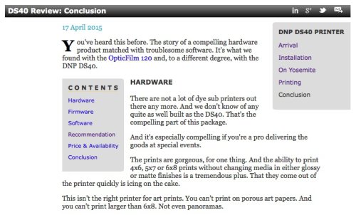
The Original. What we've been doing. Our new scheme is used on this story.
We've been inserting a gray runaround box with a link to every subhead. And when you get to the subhead there's a link back to the Table of Contents box.
TWO PROBLEMS
That's worked since Naismith was weaving baskets. But there have always been two problems with it:
- The first is that we can't put a full-width image high in the story because the Table of Contents eats into the column.
- The second is that we can't put any bulleted lists (like, ahem, this one) alongside the Table of Contents because they don't render properly. The bullets don't remember the column margin and end up on the edge of the box.
So what could we do differently?
AN IDEA
Well, we have some CSS elements like the Jump and Find boxes that sit on the major pages independently of anything else. We like that. Open Jump in a one of the older headline pages, for example, and you can move around the whole year month by month without losing the Jump list.
Just the ticket. A Table of Contents should always be handy and never in the way.
If it seems like a lot of work for something as simple as a table of contents, imagine what those Lightroom CC revisions today involved.
We do have a lot of room on our pages, particularly on the right. We like to keep the length of a text line short enough to scan (which is something of a lost art).
Why not drop the Table of Contents there?
THE FIRST VERSIONS we tried looked like the Table of Contents we've always used. A gray box. We just repositioned it off on the pinstriped background. But it didn't look like part of the story there. It looked like part of the site instead.
So we moved it onto the white "sheet." That was better. It belonged to the story. But it seemed too prominent, more important than the story.
So we dropped the gray background. And we aligned the left margin of the text with the headline bar, tucking it in. To make sure the subheads would fit, we made the font size a little bit smaller.
Somehow that design held together as a Table of Contents instead of disembodied lines of text. And it didn't intrude. You could read the story without being distracted by the Table of Contents.
Handy but not in the way.
TWO TEST CASES
We tried it on yesterday's Photos review and liked it. So we used it as we worked on the draft of today's Lightroom review. But we didn't have very many subheads and it looked a little silly with just four links.
So we decided to add the minor subheads (something we always wanted to do anyway), which are always just a line in italics. And indent them and italicize them, too. That took us the whole fourth quarter but it kept us from panicking and the code to automatically assemble the table worked out very nicely. We never have to give it a thought.
That involved updating two templates we use that had not had to worry about Table of Contents before because the tables were in the body of the text. But that was no trouble.
As we tried the new design on our two recent reviews, we realized we had one more problem to solve. How do you get back to the top?
We tried putting an anchor in various places, but we really did want the original view of the story, the one you get when you come from the headline page. Our simple solution was simply to reload the page (which is already cached anyway).
A LOT OF WORK
A little graphic design, a little coding and several revisions later, prompted by some testing, we had something we liked. If it seems like a lot of work for something as simple as a table of contents, imagine what those Lightroom CC revisions today involved.
See what you think. Let us know how you feel about it.