Photo Corners headlinesarchivemikepasini.com
![]()
A S C R A P B O O K O F S O L U T I O N S F O R T H E P H O T O G R A P H E R
![]()
Enhancing the enjoyment of taking pictures with news that matters, features that entertain and images that delight. Published frequently.
The Split-Toning Solution


13 May 2015
Sometimes it's just too easy to outsmart yourself. We thought we'd present both the black-and-white and sepia enlargements we made from an old scan to Mom so she could pick which one she wanted framed.
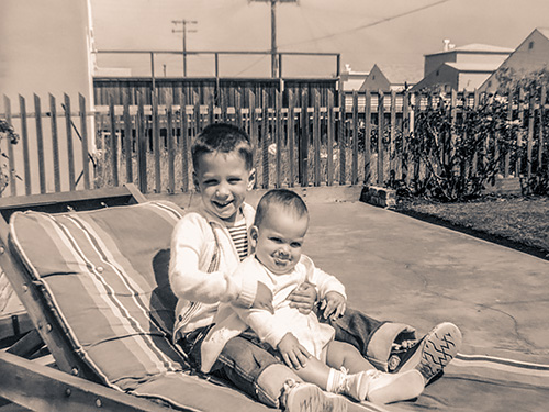
She couldn't decide.
Was one sharper than the other? No, they're the same image, one's just sepia toned.
We held them up over a framed image of the same size so she could get an idea of what they would look like framed. But she still couldn't decide.
We saw her point. They were both beautiful.
But that put us in a little predicament because we only had a car for that afternoon. And we needed a car to get to the frame store. What to do?
Split tone, that's what.
SPLIT TONE
In a toned image, like our sepia-toned version of the scan, a single color is used to tint the image from shadows to highlights.
In a split-toned image, though, a different hue is used to color the highlights than is used to color the shadows of an image. A darker or cooler hue, for example, could be used for the shadows up through the midtones with a lighter or warmer hue coloring the midtones through the highlights.
She could have her cake and eat it too.
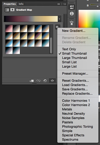
Gradient Map. Click the gear for the set of Photographic Toning options.
TWO METHODS
Any image editor should have a split toning option (somewhere). Lightroom, for example, makes it pretty obvious with a Split Toning panel in its Develop module.
But Photoshop makes it pretty hard to find while offering two different approaches:
- Like Lightroom, Camera Raw (and the Camera Raw filter) has a Split Toning panel (the fifth from the left), which we show below. This lets you select the hue and set the saturation for each color. It also lets you shift the threshold between shadows and highlights.
- Photoshop also provides a Gradient Map adjustment layer (right) which has a number of Photographic Toning presets available to try. Julieanne Kost demonstrates how to get at them (it's tricky but our screen shot shows you where to click) and provides a Photoshop file you can download to preview all of them on your own image as well.
GRADIENT MAP
Some time ago, we wrote about using the second approach on our 75th anniversary photo of the Golden Gate Bridge. We've reprised the piece below, adding an illustration.
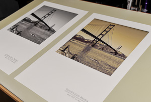
The image we used illustrates the magic split toning can bring to an image, turning a black and white capture into a faux color image. Here's a side-by-side comparison:
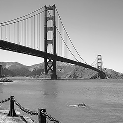
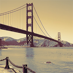
You can see how the gradient map we applied to that image turned the bridge red, the hills green and brown, and the bay blue.
It's fun to try those gradient maps on an image and it's easy to do it with Kost's Photoshop master file.
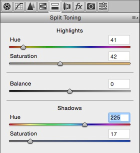
Split Toning. These are the settings we used on our image. Note the Saturation slider shows the Hue.
SPLIT TONING
But sometimes you want to play around without restraints. The Split Toning controls allow you to do just that.
With Saturation set at 0, you won't see any change as you pick a Hue, so set the Saturation to something higher, then watch your image as you move the Hue slider through the options.
We liked a sepia Hue for the Highlight because it resembled a skin tone. And we wanted it fairly dominant, so we set Saturation at 42.
We wanted the Shadow to resemble our black and white image but add a bit of color to it. So we picked a blue Hue and increased the Saturation half as much as the Highlight.
The sliders make it easy to optimize the Saturation setting. Just play around a bit.
PROBLEM SOLVED
We'd gone to the frame store before we made our edits, picking a reddish wood frame and a cream mat that would have set the sepia image off nicely. Had we preferred the black and white image, we would have gone for a black wood frame and a white mat.
But our warmer frame and mat worked very well for the split-toned image, too.
We knew that as soon as we presented it to Mom. She loved it.
Split-Toning the Bridge
What started as an innocent afternoon with photographer Arthur Tress has become an adventure in photography around here. We've already told the story of our multi-panel print and in the last issue we were about to print our bridge triptych.
Except a funny thing happened on the way to the printer.
We liked our middle image so much that we decided to print it by itself. Because the format of the image is square (echoing Tress's Rollieflex images), we placed it in the top part of our 13x19 page. To put the bottom of the sheet to work, we added a three-line caption identifying the bridge, the occasion and the dates -- all flush right like a signature and in that elegant font, Trajan Pro.
We left only a half-inch border on the top and sides, though, making it a bit of a tight fit with a mat. And the black and white test print muddied up some of the bridge detail in the shadows where we wanted some separation between the outside girders and the belly of the roadway.
But before we got around to making those adjustments, we caught a Scott Kelby video on Photoshop CS6's lesser known wonders. One of which is a Photographic Toning option in the Gradient Editor.
It's lesser known for a reason. Not only is it obscure, but the only way you'll even see it is by clicking on the tiny gear icon on the Presets panel of the dialog box.
To imprint the new feature on our memory, we thought we'd try it on our bridge image.
So we added a Gradient Map adjustment layer (making it easy to turn the effect on or off) and clicked on the displayed gradient. Then we clicked the gear icon to set Photographic Toning and looked at our options.
The options are displayed as small squares with the darker tone in the top left and the lighter tone in the bottom right. But as you scroll through them you see they become more complex, offering multiple colors for the different tones.
You might, that is, have black for the shadows but blue for the lighter shadows and pink for the midtones and yellow for the highlights. That's split toning. Tones are represented by at least two different colors.
That's a bit beyond the more familiar sepia toning where, in its simplest form, one color is used throughout the image. Or even a duotone effect (mimicking the graphics arts technique) in which the image is enriched by using a darker color for shadow detail and a lighter one for highlights. On a duotone, that darker color disappears in the highlights and the lighter color goes 100 percent through the shadows.
In digital split toning, there's certainly overlap between adjacent colors on the tonal scale but they aren't obliged to range as far. The effect can be quite dramatic. And, in fact, our bridge black and white suddenly took on an aged color chrome appearance when we used a black-red-blue-yellow option.
This version of the poster had more generous one-inch borders, which we were anxious to evaluate on paper. So we printed the strange image and let it dry for a few hours to see what we thought about it.
There's nothing quite like leaving a print out in plain sight to see how you feel about it.
It was, at first, pretty eerie. The sky, all highlights, had a golden glow from the yellow. The bridge, which was dark but not black, actually printed red. And the water, which was midtones, seemed blue. That's how it acquired the aged color chrome appearance.
Like the black and white version, it might have been taken in 1937. And that's definitely part of the design.
As if, we should say, adventures like this can be said to have a design at all!