Photo Corners headlinesarchivemikepasini.com
![]()
A S C R A P B O O K O F S O L U T I O N S F O R T H E P H O T O G R A P H E R
![]()
Enhancing the enjoyment of taking pictures with news that matters, features that entertain and images that delight. Published frequently.
Friday Slide Show: Everyday Textures


10 July 2015
We were trying to think of some subjects we could shoot that would demonstrate the usefulness of incident light metering. Why? Because we were testing the Polaris Karat flash meter. And it does incident light metering.
Your camera meter can give a different weight to the scene your sensor sees depending on what mode you've selected but it's always reading reflected light. It averages the data to concoct an exposure to give you a middle gray so black cats and brides in white look grayer than they should.
An incident meter turns its back on reflected light.
It looks at the light source and figures out the exposure based on the strength of the light falling on the subject rather than reflected by it. It's harder to fool. Your cat will stay black, your bride white.
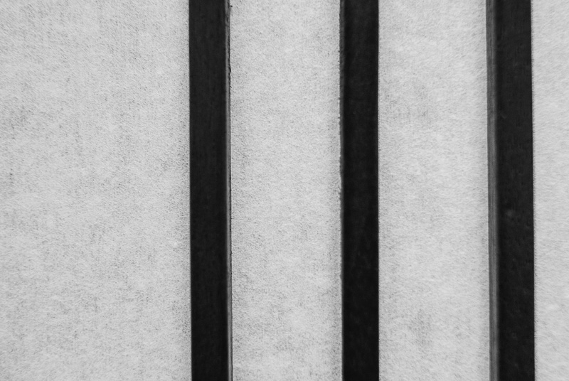
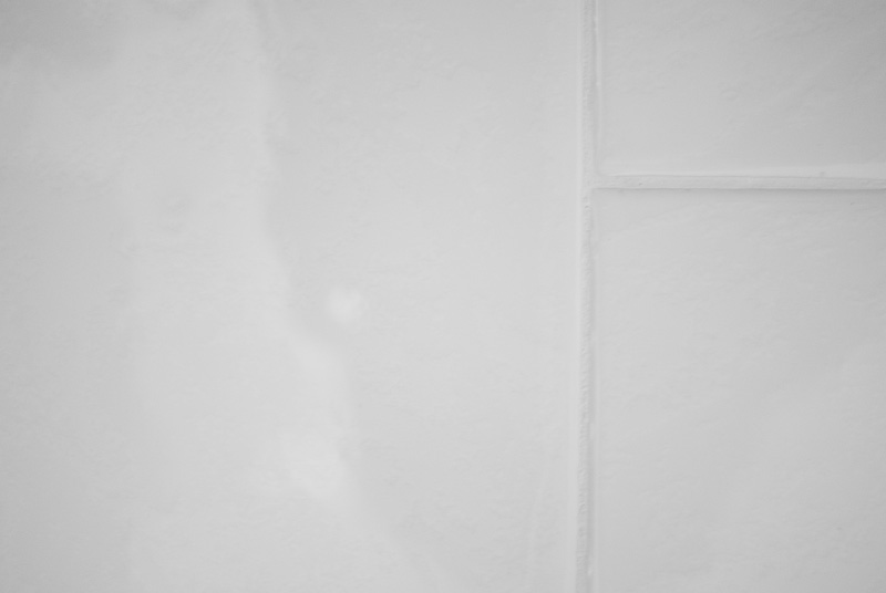
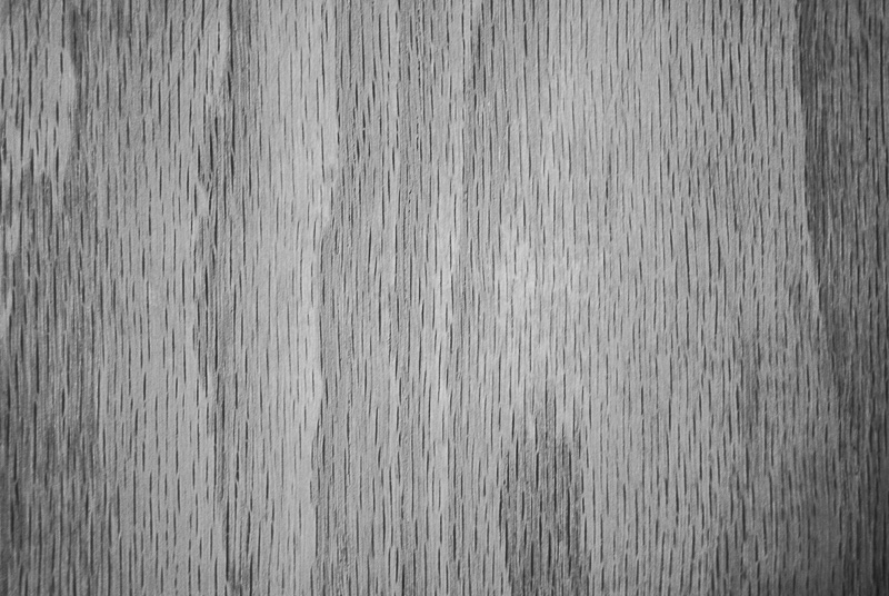
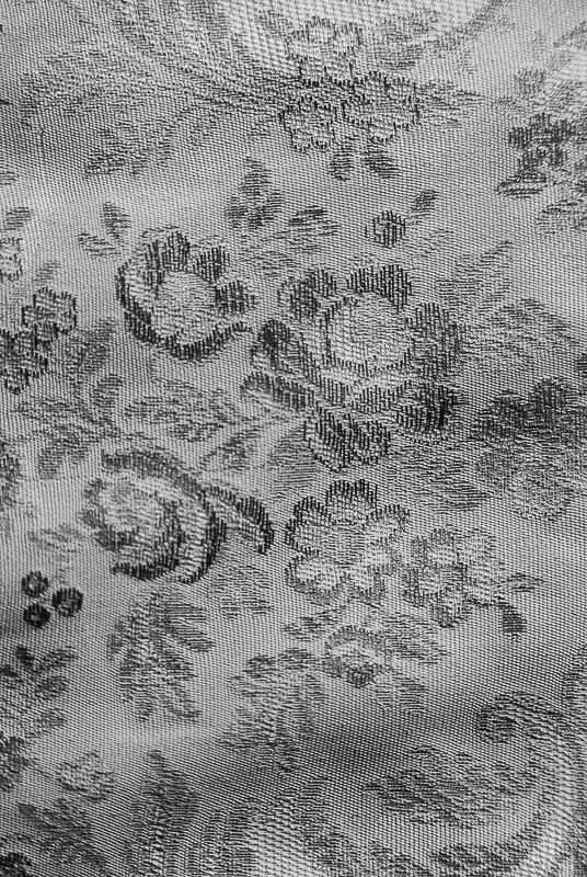
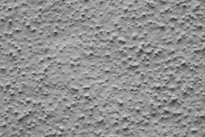
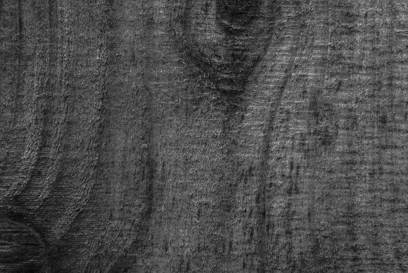
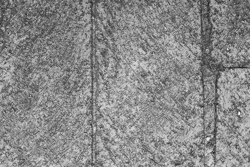
We had to get pretty close to our household subjects for that so this became a study in textures.
So we thought we'd take incident readings of close-ups that were predominantly one shade, rather than a mix of tones. Subjects, that is, which would easily confuse the built-in reflective meter.
We had to get pretty close to our household subjects for that so this became a study in textures.
And not just ordinary textures, we soon realized, but everyday textures. Textures with some importance, some value, an indispensiblity rather than invisible, unremarkable, standard but uninspired equipment.
And just to make it more interesting, we converted everything to black and white. Just the tones themselves. Just the textures themselves.
The color exposures we had metered with the Polaris Karat were accurate. But the black and white conversion gave us an opportunity to play around quite a bit. We adjusted every Basic slider in Lightroom CC to get these images but the All-Star of the team was Contrast. Clarity and Black were right there, too.
As much fun as we had, we thought you'd be amused trying to guess what these textures really are. We have, of course, revealed them in the captions but we've displayed the captions upside down to render harmless the inevitable glance.
The only hint we'll give you is that half of them are indoors and the other half outdoors. Some are pretty obvious, a few somewhat obscure.