C O N T E N T S
•
Photo Corners headlinesarchivemikepasini.com
![]()
A S C R A P B O O K O F S O L U T I O N S F O R T H E P H O T O G R A P H E R
![]()
Enhancing the enjoyment of taking pictures with news that matters, features that entertain and images that delight. Published frequently.
The Post Processing Post


4 April 2016
Sunday mornings are strange around here. We listen to New Dimensions on the radio rather than roll out of bed and when it goes too far off the reservation for us we scroll through the news on our iPhone to avoid rising.
This Sunday Colleen Mauro was talking about losing her job at a magazine and worrying about being unemployed. She had begun to obsessively checking her bank balance when she decided to give herself 24 hours off.
So she planted bulbs. And out in the fresh air an idea occurred to her, which to cut to the chase, was to start a magazine about intuition.
Out of the pan, we thought, into the fire.
Which is also how we think about getting out of bed on Sunday mornings. But we did it anyway. Inevitably, you might say. There was coffee to brew at least.
WHAT PEOPLE ARE SAYING
You don't see much of the feedback we get at Photo Corners because it's primarily personal exchanges. We never had any interest in opening the steel doors on the site to anonymous commenters but we've always been fond of Letters to the Editor, so our feedback uses your email to communicate with us.
But we do read comments on other sites and even a few special interest groups. As we did this Sunday when one troubled soul wondered about "post production processing."
He cited what he used and suggested it was inadequate to get the results he admired on sites like 500px.
The responses were not particularly helpful. Most cited the software they used (which wasn't the same as what the troubled soul used) or discounted the importance of post processing itself.
Certainly some people like to jump out of the pan and into the fire. And others all the way to hell. But every image needs to be sauteed.
Out of the fire, down to hell, we thought.
ALL IMAGES ARE PROCESSED
In the film era, no one discounted the importance of processing film. You never saw your image if you didn't get it developed and printed.
We used to know one of those "photographers" who had "an eye" and took pictures that were sometimes published in the local Sunday magazine. He never touched a darkroom door knob, though, preferring to hunt around for a lab that would make pretty prints.
We knew one such lab he grew fond of and the technician who would labor over his images to make them shine. He would explain to us the choices he was making and we would get a little uncomfortable, thinking these were really choices the photographer should be making.
Ah, choices. They're what makes a craft an art.
In the digital era, we can see the image without going to a lab. It's right there on the camera's LCD.
But that image, whether a JPEG or from a Raw file, has been processed. A digital camera can't capture an image without processing its filtered luminance data.
CHOICES ARE REAL
That JPEG is processed according to a number of settings (like sharpening or color treatment options) you either consciously configure or that have defaults. And that Raw file you think you're seeing on the LCD is just a JPEG thumbnail of the data, one of many possibilities.
When you make choices about the JPEG rendering, you're not referencing the image (which hasn't been captured yet). When you make choices on your computer about an image file, you are referencing that particular image. Your choices have a good deal more meaning for any particular image because you're conscious of the image.
Your camera can't capture more than you can see but it can capture more than can be displayed by a monitor or print. So either the camera makes tone and color choices based on its defaults or your preferences to create a JPEG or you make them later when processing a Raw file.
Sometimes you just don't have the time to make them later. Sports photography, for example. And photojournalism. But by judiciously making choices about the JPEG rendering, you optimize the capture for its intended use.
So it's just silly to believe post processing inevitably makes your image look less real. Certainly some people like to jump out of the pan and into the fire. And others all the way to hell. But every image needs to be sauteed.
A REAL WORLD EXAMPLE
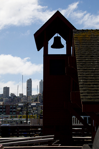
In last Friday's slide show we presented some images from Fisherman's Wharf. We went there intending to take one shot in particular. It was of the little chapel hidden among the docks. It's not on the tour. You have to wander around to find it.
But when we got there, the shot we had imagined wasn't possible because some event had taken over that end of the dock with tables and chairs set out and a table full of champagne on ice ready for the attendees.
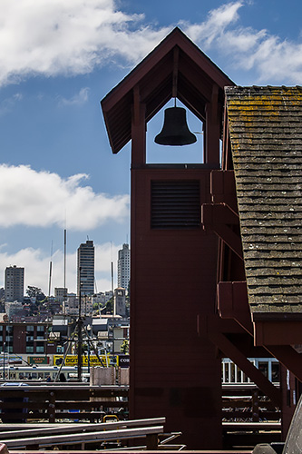
So we wandered by and turned back into the sun and caught the bell tower against the city's skyscrapers. That turned out to be our shot.
The capture was a Raw. We glanced at the LCD to make sure we'd framed it properly and let it go at that. It looked like a silhouette but the highlights were still there so we knew we could work with it.
We even looked forward to working with it. It's half the fun, as we jolly like to say.
Back at the bunker, we applied our usual settings, which we've encapsulated into a preset and then evaluated the histogram, tweaking the sliders for that particular image.
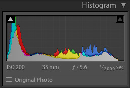
Histogram. Distribution of tones by color channel in the After image.
Here's where our troubled soul missed the boat.
Whether you use Camera Raw, DxO Optics Pro, Iridient Developer, Affinity Photo, Google Photos, Apple Photos or any other application that can render an image from data, you are confronted with the same choices.
Is the exposure too dark or too light? Are there highlights to recover or darken? Is there shadow detail to bring up? Are there tones to be shifted into black or into white? Could that lens use a little help with a midtone contrast boost using Clarity to sharpen things up?
How about the color balance? Warmer, cooler or just right? Are you disturbed by too red or too green a tint? Should we dump the color all together and work in monotone? Maybe a duotone?
Still too dark or light? Maybe a Curves adjustment to finesse something that's bothering you?

Basic Adjustments. Our settings for the After image.
Then there's the lens distortions to consider. Any chromatic aberration to address? How about converging verticals?
Those are the general questions we ask about every image. But not explicitly. We're sensitive to what bothers us about the image and we know how to address it. And it never hurts to just move those sliders one at a time to see what happens. See A Checklist For Post Processing for some tips on how to proceed.
That's the trick our tortured soul missed. Knowing where you want to go and how to get there.
On our bell tower we were glad to see that our preset had restored detail to the silhouette so it wasn't pitch black as it might have been on just a JPEG. But the verticals were converging, ruining the echo of the skyscrapers to the somewhat distorted tower. That was easily fixed by our software with a single click.
We had highlight detail in the clouds so we were done with the image. Not a lot of post processing but a far cry from a camera JPEG. And that far cry was essential to what we wanted to get out of the image. We looked at that bell tower on the dock and knew the image we wanted to make, framed it in the camera and finished it in post.
And our soul suffered no torture at all.
AND ANOTHER THING
Our Before/After real world example above represents our choices for the Web-based slide show, not necessarily the best options for every purpose.
You may not like something about After. You might have done it differently.
That's exactly what happens when you get out of the pan and into the fire of post processing.