C O N T E N T S
Photo Corners headlinesarchivemikepasini.com
![]()
A S C R A P B O O K O F S O L U T I O N S F O R T H E P H O T O G R A P H E R
![]()
Enhancing the enjoyment of taking pictures with news that matters, features that entertain and images that delight. Published frequently.
Under Construction: Editing An Image


2 August 2016
In our Friday Slide Shows we tend to brush off our edits in a paragraph, citing the Basic edits and maybe the Upright tool but not getting into the step-by-step details. So we thought we'd walk through a set of typical edits on a simple image.
The above rollover lets you compare the Before image, which is the thumbnail stored in the Raw capture, to the After image, which is our edited final.
It's a modest improvement but after seeing the After image we don't think anyone is going to prefer the Before image. Unfortunately so many of the shots we take remain Befores.
That may be because it may seem like a lot of work getting from Before to After. Actually, it's a lot of fun. So much so that you'll wish it took longer than it does. There are quite a few steps in this edit but the whole thing can be done in a couple of minutes.
We'll use Adobe Camera Raw but you can do this (or something like it) in any Raw editor.
THE PROGRESSION
In an earlier draft of this article, we just plopped a screen shot of the step into the section that explains it. Then we made those screen shots popups so you could see the details.
But something was missing. As you scroll down, you lose any appreciation of the change that occurs to the image after each edit.
So we're stringing them all together here in a rollover so you can just run your cursor over the buttons to see the changes.
Now you can study the detailed edits in their popups below.
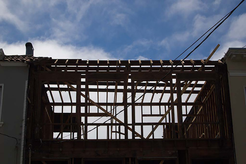
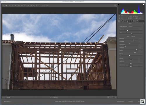
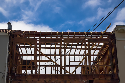
WHAT THE CAMERA SAW
Our example image is a snapshot of some construction we ran across the other day. We liked the bare framing against the blue sky.

Camera Image. The Raw data presented in Camera Raw.
But the camera capture has some problems. We weren't standing in the best possible spot (although we thought we were), so the horizontal lines are converging. And while the exposure of the sky is not bad, the framing is a bit too silhouetted (not a bad thing in itself).
Those are a couple of simple corrections but they'll serve to illustrate the process.
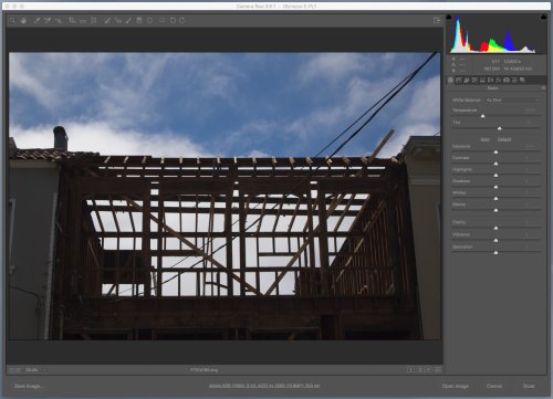
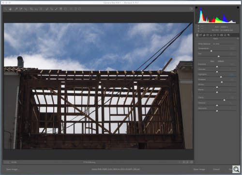
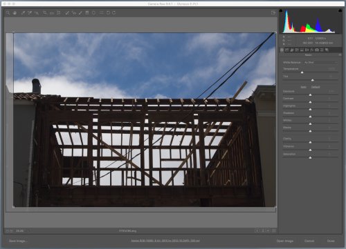
STEP 1: CONVERGENCE
We have two convergence problems in this composition. Both the horizontals and the verticals converge. The horizontals to the right and the verticals to the top.
Convergence. Using the Upright tool to fix the horizontal convergence.
We could correct both with the Upright tool by drawing four lines. But we don't see the vertical convergence as a problem. We're looking up and we want to keep that perspective.
But the horizontals are disturbing. So we drew two lines, slightly off the timbers to make it easy to make them ride along each straight line.
Now it's as if we were standing directly in front of the building and looking up. Perfect.
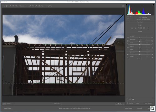
STEP 2: CROP
With the image squared, we can consider the crop. It's off center.
But before we correct that, we have to consider the aspect ratio. This was shot on a dSLR with a 3:2 aspect ratio. Do we want to maintain that? Or do we want this cropped to a 16:9 aspect ratio (which we like for the site)?
Crop. Same aspect ratio but improved.
A 16:9 aspect ratio is not very deep. So we'll either lose some sky or the floor of the construction.
We didn't like either option so we stuck with 3:2, which lets us have both.
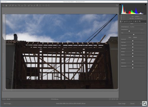
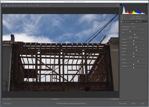
STEP 3: BASIC TONES
All that was corrective surgery. Now comes the fun part. And that would be fooling around with the tonality of the image.
Just imagine we're working on a black-and-white image in which we want to see some detail in the darkest part of the image and some in the lightest and maybe shift the tones between them a little darker or a little lighter.
Auto. Tonality courtesy of Camera Raw.
We can just hit the Auto button to see what Camera Raw thinks should happen. This is a great place to start if this is all new to you. It's usually wrong. Camera Raw can't see the image, after all. But it's usually helpful in pointing out which sliders should get some attention.
We approach this a little differently, as we pointed out in A Checklist for Post Processing.
Our eyes tell us the sky is pretty close to what it should be but the framing is too dark.
Before we correct that, though, we punch up the Clarity so we have the acuity we expect. This shifts the tones a bit, which is why it's the first thing we do.
Then we can attend to our Shadow slider to make sure the framing has some detail. Just the barest of detail (or a little more, since this is going to be reduced for display on the Web).
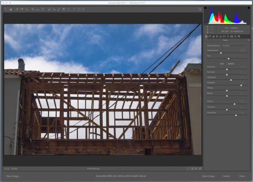
Manual. Tonality by eye.
We do shift the other sliders a bit left and right to see if they can help the image but in this case, not much.
Our biggest disagreement with Camera Raw's Auto is with the Highlights. We lighten them. Camera Raw darkens them. But Camera Raw has to darken them because it's increased the overall Exposure significantly to boost the framing.
Compare the two histograms at the top to see how the two approaches differ in their handling of the image's tones. And why your eye is better than Camera Raw's analysis.
STEP 4: REFINEMENT
We're close with the Basic adjustments. We don't have to fiddle with the color at all. We don't have much color beyond the blue sky and that's fine.
But we would like to darken that sky.
So we click the Curves option and set three points on the scale, one each for Shadows, Midtones and Highlights. This not only lets us manipulate those values but also anchors the others so they don't change.
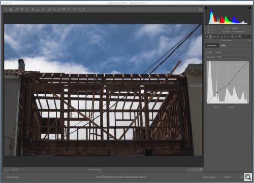
Curves. Shifting the Midtones.
Dropping the anchor down darkens, raising it lightens. Here we've darkened the Midtone and just slightly lightened the Shadows a bit more.
But we weren't quite done. The last two adjustments, which we don't generally do, were to increase the Saturation to bring out the wood color and to move more of the darker tones into Black.
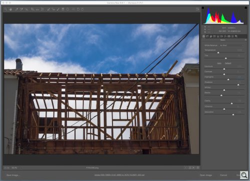
Boost. Final adjustments.
So the orange of the wood now comes through. And the very dark grays that didn't really add any detail to the Shadows are now blacks, giving us a little more definition in the Shadows.
Those two changes really are refinements you appreciate by training your eye. And you do that by playing around with images you are happy with to see how much further you can go.
CONCLUSION
This is the kind of shot that confuses a smartphone, which will expose for the sky and silhouette the building. And because it's capturing a JPEG, it will throw away a lot of the detail in the darker areas of the image that a Raw capture will retain for recovery.
But even a dSLR will be confused by this image in the same way. The advantage is that you can shift exposure a bit with Exposure Compensation (not usually an option in a smartphone) or just recover the detail in post processing (as we've done here) because you can capture the Raw data (coming soon to a smartphone near you), which contains more information than you can see at one time on your screen.
With a very little time in post processing, you can get the image you saw rather than the one your camera snapped.