C O N T E N T S
Photo Corners headlinesarchivemikepasini.com
![]()
A S C R A P B O O K O F S O L U T I O N S F O R T H E P H O T O G R A P H E R
![]()
Enhancing the enjoyment of taking pictures with news that matters, features that entertain and images that delight. Published frequently.
Google Photos Evolves


17 November 2016
In a longer-than-usual post on his personal blog today, Google's Product Manager of Digital Photography John Nack discussed the evolution of Google+ into Google Photos.
He joined the Google Photos team, he begins, just after they'd integrated Snapseed into Google+. But they discovered that most people didn't tap into the extra power Snapseed provided.
Most people, Nack adds, just want to "crop, rotate, tweak brightness and maybe apply a filter."
That led the team to design a new editor from scratch.
"We aimed to deliver great results in a single tap," he explains, "offer just a few powerful sliders (which under the hood adjusted numerous parameters), and keep Snapseed just one extra tap away (via the overflow menu) for nerds like me."
The key to designing Google Photos, Nack points out, was to learn from users' behavior "then thoughtfully enable just the controls needed to deliver extra power when needed."
On Tuesday, an update to Google Photos was released for Android, iOS and the Web. There is no desktop application apart from the Web version.
The update brings that simple interface with more power just a tap away.
TRYING IT OUT
We gave it a try earlier today, using one of the images we scanned using the new Google PhotoScan app. We weren't happy with what Google PhotoScan delivered, even if some of the blame was our own.
But that made it a good test case. It needed a lot of work.
The first thing to note is that we didn't have to chase after the image or upload it to the Web. Our phone had already sent it to our free and unlimited storage space. It was there waiting for us.
Google does that right and we'll just take a moment to applaud them. Apple does much the same, it's true, but Apple doesn't give you unlimited free storage. That makes it a poor solution in comparison.
Using the Web version, we clicked on the image and clicked on the pencil icon to get into Editing mode.
We will whine about Google's move to icons for menu items. We spent a good few precious minutes of our remaining time on this earth last night trying to figure out how the Google Mail app deletes a draft email. It isn't obvious and the icons just take you places you don't want to go.
On the Web version, hovering over an icon will reveal its name. But touch devices don't do hovering.
SIMPLE EDITING MODE
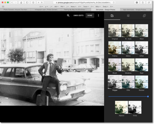
Editing mode presents a set of thumbnails that reminds us of Photoshop's old Variations mode and also resemble's Apple Photos Edit mode. You can see at a glance several alternatives and try them out.

Simple Editing. Original, Auto and some filters but no Cancel.
In Google Photos, when you select one of the edits (Original is there, too, if you go too far), a slider appears so you can fade the effect back. Nice touch.
Oddly enough, given the iconization of menu items in the user interface, all these options have names. Weird names but names. West, Palma, Metro, Eiffel, Modena, Bazaar, Ollie, Alpaca, etc.
There's also an Auto, which Nack claims does the trick for him most of the time.
SAVE YOUR WORK
This is non-destructive editing, so if you get somewhere you like, you should save a copy of it before continuing. That way, you'll prevent Google Photos from going all the way back to the original image if you tap Original.
There is a Done button but there's no Cancel button.
Which is odd because there is an Undo Edits option when you tap the Sliders icon for more advanced editing options.
ADVANCED EDITING
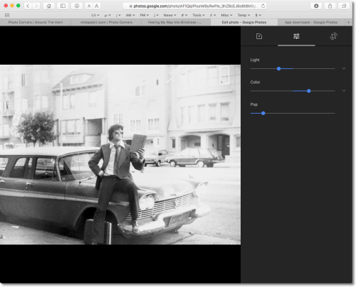
Even advanced editing presents a simple interface of only three sliders at first: Light, Color and Pop. Light and Color, however, can be expanded by tapping the arrow on the left.

Advanced Editing. Tapping the pencil icon gets you here.
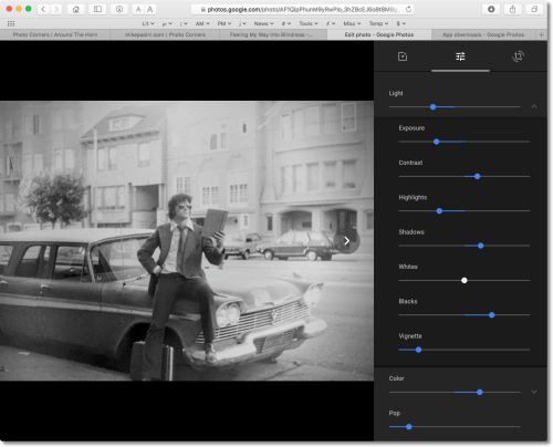
And when we did expand Light, we saw a healthy list of sliders, not unlike Adobe Camera Raw: Exposure, Contrast, Highlights, Shadows, Whites, Blacks, Vignette. If we had applied a look in simple editing, the sliders reflected that.
Missing in action were some of the more handy sliders we use in Camera Raw like Clarify. And there's no DeHaze.

Expanding Light. More options under Light and Color.
Color offers sliders for Saturation, Warmth, Tint, Skin Tone and Deep Blue.
As you work, Google Photos adds a text reminder that you can click and hold to compare versions. That's something that would have been handy last night.
HELP
Nack ends his post with some helpful keyboard shortcuts. But that points out another problem. You wouldn't know about these unless he told you.
There's really nothing that approaches any kind of Help.
We suppose that's because the goal of the user interface mavens was to make everything so obvious that you don't need help. But Google Photos isn't there yet.
CONCLUSION
Both Apple and Google have gone back to the drawing board in pursuit of the next generation of image editing software. And they have developed remarkably similar concepts.
But the products remain immature.
Yesterday, for example, DxO released ViewPoint 3 with automatic perspective correction, catching up with the same feature in Lightroom and Photoshop. There's nothing like that in Apple Photos or Google Photos. And yet we use it a lot on our images.
Clarity and Dehaze in Adobe Camera Raw are also important tools for improving your images.
So while we applaud the evolution of the new generation of image editing software, we don't rely on these new apps. We give them a whirl, pat them on the head and then go back to DxO Optics Pro, Lightroom, Photoshop, Exposure X2 and Capture One 9 to mine the beauty in our files.