Photo Corners headlinesarchivemikepasini.com
![]()
A S C R A P B O O K O F S O L U T I O N S F O R T H E P H O T O G R A P H E R
![]()
Enhancing the enjoyment of taking pictures with news that matters, features that entertain and images that delight. Published frequently.
Friday Slide Show: Early Monet


12 May 2017
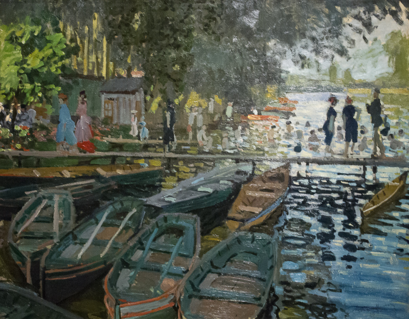
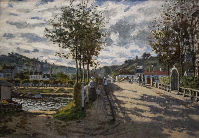
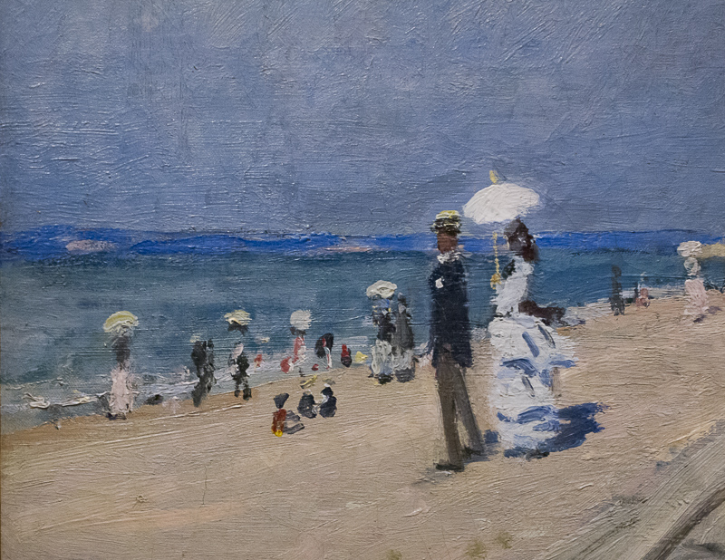
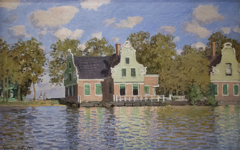
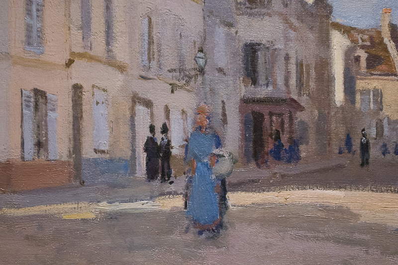
The Legion of Honor exhibition Monet: The Early Years ends May 29, so we made sure to visit it a second time this week. And this time we brought along a camera (or two).
Among the many themes we have discarded was a comparison of Monet's early works with Roll #1 of Diane Arbus, whose show of small early black-and-white prints just closed at SFMOMA. We thought it would be a great one-two punch for budding artists. An inspiring one-two, that is.
Instead you get this slide show.
It wasn't easy, though. The exhibit has been mobbed. Monet is easy to love. There is something magical about seeing his brush strokes transform into something recognizable (and pleasant). Compare to the photo reductions Harold Davis creates with the Waterlogue app, which charm but lack the magic of Monet's brush strokes.
Our first visit was early in the run and we could hardly get around. There just wasn't any open floor space between all the Monet fans.
So we vowed to return with a camera because there were only two paintings that could not be photographed in the exhibit. And frankly, the stuff in the museum store, was not very faithful to the originals. Color was way off both in the prints and the books.
Even on the day we returned, it was busy. One fellow collapsed to the floor near the end of the exhibit (he was revived). And a dear woman who passed in front of us just as we snapped our shutter, turned in absolute horror to apologize, insisting we take the photo again. We didn't tell her no harm had befallen our composition because we'd easily been able to shoot over her five-foot frame.
TOOLS
Patience, as we've said about working the Bouquets to Art shows, is the only tactic that works. Just wait your turn to stand squarely in front of the painting at a suitable distance. People will eventually move away. A few may step in front of you but they'll move too. Eventually. Just stand your ground and while you do, why not admire the painting?
We've had excellent results shooting with an iPhone 6 Plus in museums. Our phone camera is image stabilized, which helps more than we can say. But the wide angle lens is more suitable to large paintings like those in the Botticelli to Braque exhibit. The Monets were a variety of sizes but befitting a young artist, mostly small.
So, we opted for our mirrorless with body-based image stabilized camera and a zoom lens. You really can't move closer or farther away from a painting in a crowded exhibit, so a zoom, used near the middle of its range, is essential.
So what separates these images from the smartphone photos of the same paintings is: image stabilization, optical zoom and measuring the color temperature of the light.
Lighting is an issue, too. To protect the pigments in the paintings, museum lighting is always very dim. Just bright enough, you might say, for the eye to discern color.
Normally we'd worry about using a high ISO not so much for the noise as for the diminishing dynamic range high ISO brings with it. But we're talking about paintings here not real world landscapes. Paintings themselves have a quite limited dynamic range. Not one of our shots stretched across the whole histogram.
And museum lighting is almost always artificial (some rooms do diffuse sunlight with skylights) with it's own color temperature.
So we began our shoot by taking a snapshot of our credit-card sized WhiBal in the exhibit lighting. That would allow us to establish our white balance in Lightroom. We could also have used it to set a Custom white balance in the camera, but we weren't shooting JPEGs. We were, as usual, shooting Raw.
We ended up with typical exposures of f5.6 at 1/20 to 1/40 second and ISO 1600 with a light value of 5.3 to 6.3, pretty low.
So what separates these images from the smartphone photos of the same paintings is: image stabilization, optical zoom and measuring the color temperature of the light.
EDITING
The first thing we did back at the bunker was turn our WhiBal shot into a preset. We clicked on the gray part of the card to set the white balance and saved the preset. When we edited the first painting, we updated the preset with the Basic exposure settings.
That made quick work of color correction. But all we had to go on was our color memory, not having the originals handy. And to that end, we didn't want to present them as low-key, dim images, but as the bright jewels they had been in Monet's studio. We were, in short, able to simulate brighter light.
The next trick was to correct perspective. We're delighted that Capture One Pro, DxO OpticsPro and the Adobe line-up all provide very simple-to-use perspective controls, some of them automatic. This has been a real blessing to us and we use it without hesitation. On these images, the Auto button of the Upright tool worked well 75 percent of the time with Guided filling in the rest of the time.
The paintings, remember, are hung to point down toward the floor. So even if you shoot them straight on, you still have a perspective issue.
You also have a nice dark shadow across the top of the painting. We cropped that out with the frame. You will see a few signatures in these paintings that look aggressively cropped, but we assure you the frame did it, not us.
We did go through the shoot after the initial edits to improve a few of them, mostly adding a quarter stop of exposure to brighten them up. But that was it.
PRESENTATION
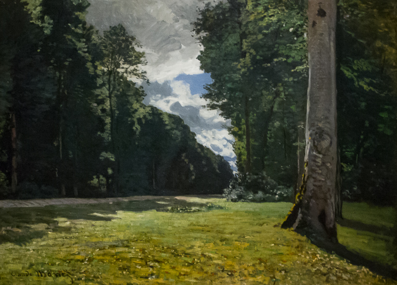
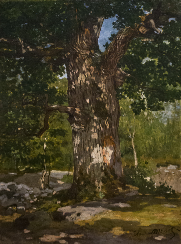
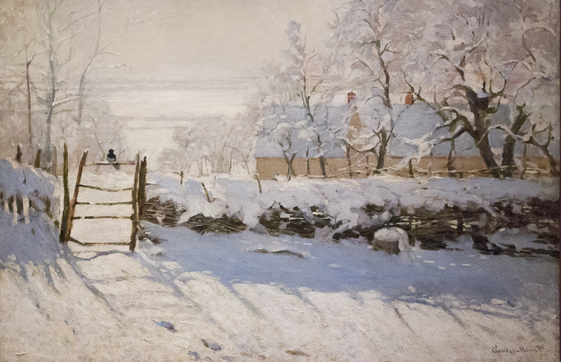
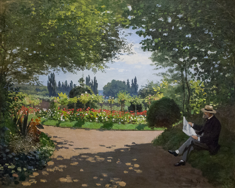
Our initial selection was 24 images -- and we left out a few we really liked. We wanted to cut it down to half that but there were two detail images of full paintings we found particularly worthwhile.
We didn't shoot every painting in the show. But we did shoot more than half of the 60 paintings or so which Monet, who was born in 1840, painted between 1858 and 1872. They are considered his pre-Impressionist works, although we see him dabbling in various techniques familiar to fans of his later work.
Our show above is just 17 images, two of which are close-up details following the larger view. But since it's Mother's Day this weekend, we've uploaded 33 higher resolution images to Google where you can enjoy an extended tour.